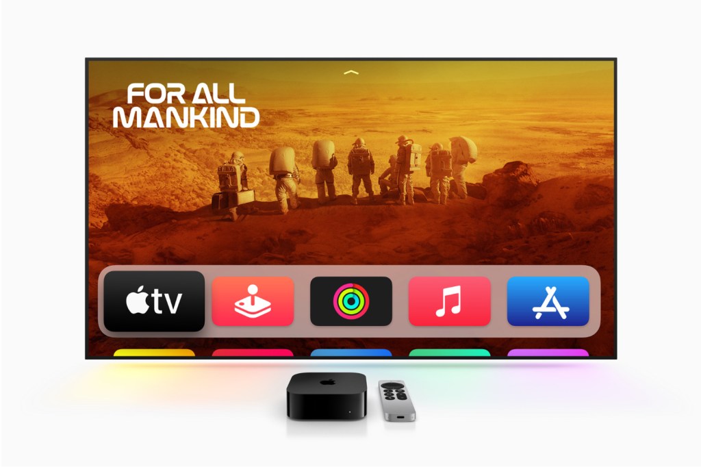
Apple’s latest update to tvOS 17.2 is like a fresh coat of paint in your living room – it’s the same room, but something feels a bit different, a bit snazzier. The headliner here is a redesign of the Apple TV app (that’s the app with Apple’s content on the physical Apple TV), which brings a sidebar-centric navigation to the forefront.
In tvOS 17.2, the sidebar now blends content from Apple’s own pantry (Apple TV+, MLS Season Pass) with third-party goodies like Disney+ and Max (formerly HBO Max). The intention? To make finding your next binge-watch a bit less like a treasure hunt. But, not all third-party content services are getting invites to this party. One big exclusion is Netflix. So, if you’re someone who flits between a bunch of different services, you might find this a tad restrictive. It’s a bit like throwing a party and only serving one brand of crisps – a bit limiting, isn’t it?
Moving on, the sidebar now includes user profiles on living room devices. It’s a decent move, letting you switch between profiles to get more personalized recommendations. But it’s somewhat confusing when each app makes you pick a profile when you launch. And that remains the case even if you enter the app via Apple TV. Apple also decided to jazz up the Watch Now tab, now called Home. It’s a bit like renaming your ‘Living Room’ to ‘The Lounge’ – sounds fancier, but it’s essentially the same thing.

Another big shake-up is the booting out of the iTunes Movies and TV Shows apps on tvOS. Now, the Apple TV app’s Store tab is where you’ll splash your cash on movies and TV shows. It’s like Apple’s streamlining their shop, putting everything in the same app and ditching the old ones. And hey, you can now answer FaceTime calls on your Apple TV 4K. It’s pretty nifty if you’re deep in the Apple ecosystem. Imagine chatting with your mates on the big screen – it’s like they’re right there in your living room, minus the need to offer them a cuppa.
But it does raise a question. If simplifying is the game, why shuffle everything behind the Apple TV app? Wouldn’t just plopping it all on the home screen be simpler? It’s a bit like being told to go through the kitchen to get to the loo – not exactly the most direct route. I’m all for this simplification, but it feels like we’re going halfway there. Accessing your content should be quicker, with fewer buttons to press and screens to skip through. So let’s just go all the way there.
tvOS 17.2 isn’t going to knock your socks off, but it’s a step in the right direction. The redesign makes navigation a bit smoother, and the integration of FaceTime is a nice touch. But limited third-party content integration and the curious decision to hide everything behind the Apple TV app does make you wonder if Apple might have missed a trick in truly simplifying the user experience. It’s like they’re almost there, but someone decided to take a detour at the last minute. Maybe in tvOS 18?


