Home Safety Hotline sees you manning a call center that helps people with the strange creatures and critters infesting their homes. And hopefully, your advice doesn’t get anyone killed. You’d at least get written up for that.
Game Developer spoke with Nick Lives of Night Signal Entertainment, creators of this supernatural call center, to talk about what interests brought ’90s chat support and cryptids together, the wild ideas that came from mixing folkloric monsters and Windows 95-era corporate software, and the complexities of creating the game’s fail state that stop players from purposely trying to botch calls to experience the interesting, morbid things that happen when you gave the wrong answer.
Game Developer: Home Safety Hotline is a game about working in a call center to help folks deal with eerie things happening in their homes. What inspired this concept?
Lives: For a while, I had been interested in making a game centered around the joys I had reading a Dungeons & Dragons Monster Manual my grandmother gifted me as a kid. So, on and off, I’d been throwing around ideas for games centered around bestiaries.
Down the line, after I was able to support my wife and me financially with game development full-time, my wife quit her call center job to pursue acting. We made friends with a lot of actors who were, themselves, looking for opportunities in the voice acting space, but we never made a game that required voice acting.
At some point, the pieces got put together that a game about working at a call center (for diagnosing monsters) would be a project that would marry a lot of these disparate opportunity desires together in a convenient (and reasonably scoped) way.
What drew you to the ’90s setting for the game? Why did that feel right for the game you wished to design?
We discovered these really interesting horror videos online in a genre dubbed “analog horror” that felt tailor-made for the kind of secondhand storytelling that the gameplay concept lent itself to, and it seemed that there weren’t very many games utilizing the subgenre’s trademark nostalgic style. The analog horror series we liked the most, Gemini Home Entertainment, seemed to draw a lot of inspiration from ’90s educational VHS tapes, and so in capturing the essence of analog horror trappings, we felt we had to set it in the same period.

Can you tell us about the thoughts and research that went into the old computer interface for the game? What ideas went into its creation?
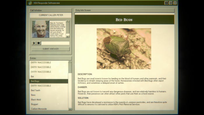
Given the ’90s setting, we looked into a lot of corporate Windows 95 software from the era and tried our best to emulate their look and feel. The first pass was a bit too flavorless on its own, so we came up with our own Home Safety Hotline-specific color palette to give the game more personality, taking some inspiration from the kind of ugly, home-brewed, hacked-together OS that you often see on company work computers.
To help maintain the feel that the player still existed on the other end of the screen physically, we then added a dust and CRT effect on top of all that, to give the impression that you’re actually looking at a monitor and not just existing within it.
You have created a great deal of creatures that homeowners can deal with—some more supernatural than others. What ideas went into the writing behind the various surreal creatures in the game? Into designing horrors that might haunt a home?
When possible, it can be fun to ground horror with existing stories, so initially, we researched what sort of pre-existing cryptids and creatures were known to live inside people’s homes, and goblins came up, which set us on a kind of fantasy/European-folklore inspired trajectory. Most of the monsters are inspired by some pre-existing folklore or fantasy creature, or are written to evoke the same whimsical, otherworldly qualities of one.
The writing style takes a lot of inspiration from other online works such as The SCP Foundation and Something Awful articles written by Zack Parsons and Josh Boruff, where otherworldly things are discussed in a mundane, grounded manner to evoke horror or comedy, respectively. In our case, we wanted both.
Likewise, how did you create the images for the more bizarre creatures? How did you capture a sense of the unknown by only showing so much of your unsettling monstrosities?
The images were heavily inspired by the works of two horror artists: Trevor Henderson and Eduardo Valdés-Hevia. They both have a knack for photoshopping bizarre things into everyday settings, so I looked to their work a lot for the best ways to incorporate our creatures into photographs.
The process involved importing photos into Photoshop, sometimes modifying the lighting to look a bit moodier or creepier, and then digitally painting the creature within, trying my best to match the lighting and tone values of the source photograph. After all that, we exported the images using Photoshop’s web export tools, which allowed us to reduce their quality to roughly ’90s web colors. That really helped incorporate the creatures even better since it was harder to pick out digital painting mistakes when the quality was reduced so drastically overall.
How did you design the call center-like play mechanics of the game? How did you build an information database around figuring out horrors for people calling in? How did you turn this information system into gameplay?
The call-and-find-an-answer mechanic was pretty much solidified from the word go. We knew that dialog options and things like that were going to be out of scope for us if we wanted to write a lot of them, so we decided early that diagnosing with the given information would be the game’s bread and butter.
Pretty early on, we figured out that a good call generally made you think of two or more entries at a time, so the challenge would be in distinguishing the nuances between the similar entries. That made difficulty balancing and content creation sort of feed into one another, since if we wanted a call to be more difficult, often we would add a new pest that had similarities just for the sole purpose of being a red herring.
The hardest part was probably trying to arrange calls in a way that made for good pacing. There was a tricky balance between arranging the entries to unlock in an order that revealed the scariest, weirdest ones last for the sake of build-up and arranging the calls in an order that felt satisfying difficulty-wise since you can’t use a call on a day that its answer (or intended red herring) isn’t available to the player. We wound up making a very wacky-looking spreadsheet that showed each call’s “potential answers,” its actual answer, and its relative difficulty when it came time to arrange the game in its final form.
How did you work the intricacies of keeping your job into Home Safety Hotline on top of the horror mystery solving? How did you design the consequences for getting things wrong? What drew you to bring troubles with a boss into the game?
We always knew it was going to be important for the horror and the comedy of the game for you to be able to hear what happens to the callers when you get an answer wrong, so we decided that each and every call would have a “consequence” written for it that would range from the mundane customer service shout-down to horrifying deaths. What we didn’t anticipate was that these calls were entertaining enough on their own that players would rather fail each call than succeed, and suddenly, reading wasn’t important anymore without a more permanent consequence for the player failing.
We didn’t want the player to have to replay too much if they failed, or be punished too severely for past mistakes that may be built up over time, so we decided on a game over that would only be triggered at the end of each in-game day if you got a certain percentage of that day’s calls wrong. The next day, you get a clean slate, so it’s almost like regenerating “health” in a way. That way, we got the right balance of hearing horrifying consequences from days past, without letting players cruise through the game without reading the entries.
The “boss” Supervisor Carol came about from the need to have a more consistent character who would be able to tease the core mystery of the company’s mysterious background throughout the game, as well as to put a face to the company. She was partially inspired by GlaDOS from the Portal series, who was important for keeping players interested in the wider story in those games.

You added some options to adjust the various horrors players might see in the game. What ideas went into figuring out what you should allow players to remove from their playthrough? How did you design this horror accessibility setting?
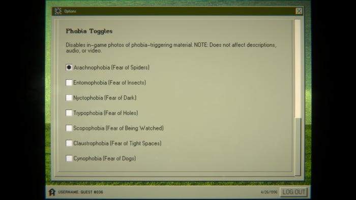
My wife (who plays Supervisor Carol in-game) has a particularly bad case of arachnophobia, and in the past, it’s stopped her from playing games she would otherwise enjoy. More recently, games like Grounded have started to accommodate this phobia, so the idea that you could make an accessibility setting like that was starting to become more commonplace.
It just so happened that, early on in development, we realized how easy it would be to disable images in-game since our descriptors made the visual component of each entry play more of a supporting role. Since we could do it, we did! Once one phobia was in, it was trivial to add more, so we wound up adding a small list of “common” phobias that were relevant to the content in-game. We decided to limit the setting to just images so as to not sacrifice any existing mechanics, since audio samples and descriptors are important for puzzling out some of the calls. In the case of the videos, it also doesn’t affect them simply because they’re pre-rendered, and re-rendering phobia-safe versions seemed out of scope for us, but we do intend to eventually at least put a warning in front of video content that is flagged with any active phobia toggles.


