
A while back, fellow DIY writer Joseph Parry and I were chatting over Messenger. We had just started following a blog called Canon of Design by Tavis Leaf Glover. Canon of Design is a treasure mine of compositional information, which studies the master painters and how they designed, constructed, and finished their masterpieces, including techniques like radiating lines composition.
These guys spent months, even years, creating one image. They left nothing to chance. They drew out the composition perfectly, over and over again, until the image was compositionally bulletproof. I could write multiple articles about the benefits of signing up for Canon of Design, but I will let you make up your own mind about that; just make sure you check it out.
Learning and changing my image
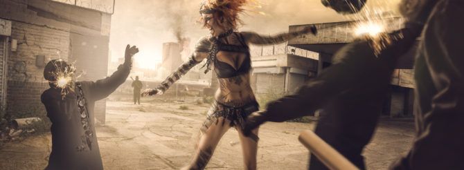
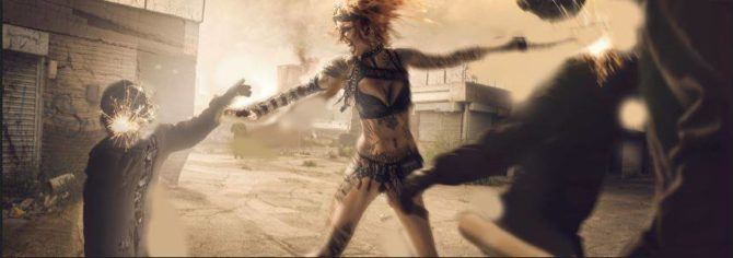
Anyway, I digress. Me and Joseph were chatting about work and art, throwing many profanities around like there was no tomorrow, most probably, when we got on to the subject of the image above. The image was, at the time, and maybe still, my largest composite image, with around 10 or more images pieced together. Part of an apocalyptic series with alternative supermodel Shelly D’inferno.
I created the image background first, using various locations around my city, with a couple of stock images thrown into the mix. Next, I photographed all the models separately, matching up the light and the angles.
Honestly, I have mixed feelings about the image. It was my most challenging composite so far, but there is something about it that doesn’t sit right with me, I feel it could have been better. But as they say, when you are not winning, you are learning! And this image I learnt in spades. From learning about the importance of pre-planning to shooting composite lighting. I had to create this image to grow.
Picking the image apart
Basic armature grid
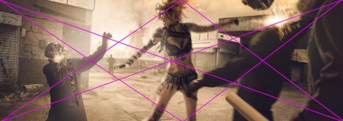
With Canon of Design in mind, we decided to go over the image and pick it apart. First off we placed an Armature grid on the image to see if the lines and points lined up at all. It’s basically a divine proportion (the Golden Ratio) grid cut with rectangles, as you’ll see in the image below.
I created this photograph before I knew about the grids, so it would be interesting to see. What is an Armature grid, I hear you asking? The grid is what all master painters used to compose their images (wait, you didn’t honestly think they used the Rule of Thirds, did you)? There are a few variants of the grid, but they all pretty much have the same diagonals and verticals in them that help guide the composition of your image and create dynamic symmetry. Here is the basic Armature grid. If you want to learn more about the grids, hop on to Canon of Design.


So we roughly drew a grid over my image to see how it fared, and to be honest, it wasn’t too bad. Maybe it was my artist’s instinct. The arm of the guy on the left was kind of lining up with the reciprocal line on the left, which also lined up with shelly’s eyes. The baroque diagonal, if you followed it along also just about lined up with the headless henchman’s shoulders. And if Shelly’s sword arm would have been a little more straight, that also would have been lining up with the baroque diagonal.
Now if you move your eyes to the bottom to the henchman holding the metal bar, it is nearly lining up with the sinister diagonal. And just above the bar, the headless henchman’s lower arm is just about lining up with the right reciprocal. So, all in all, my intuition wasn’t too bad.. But I could have done with refining it a little. But to us, this was a revelation, seeing the grid come into play, so we decided to investigate further.

Arabesque lines
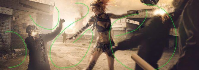
Next, we drew in the Arabesque lines. In short, the Arabesque is what guides your eyes through an image. It is the flow of an image that keeps your eyes gliding around the picture. You don’t want the Arabesque to lead you out of the image; it needs to keep you on the inside.
In my photo, the greatest threat to the Arabesque is the guy on the left. His back arches outwards, meaning his shoulder curves away, guiding the viewer’s eye out of the left side of the frame. On the opposite arm, his upwards tilted hand creates another Arabesque leading your eye upwards and out of the frame. There are ways to use the Arabesque to complement other compositional techniques, such as radiating lines composition.
To remedy these little mistakes, all you would need to do is make the henchman’s back arch forward so it curves into the photo. If we then tilted the hand down, it would line up with the direction of Shelly’s eyes, and the flow would stay in the picture. If we tilted the henchman’s head so he was looking towards Shelly, that would be even better!

Gamut
Once we finished with the Arabesque, we moved on to Gamut. Gamut is the repetition of a limited number of angles or simple shapes in a picture. It is the rhythm of your image, which the viewer should subconsciously pick up without them even noticing.
Again, I could spend a whole article on Gamut, but it would deviate from the point of this article, so make your way over to the Canon of Design to learn more. Using Yellow lines, we worked out the Gamut of the image, and again for someone who at the time knew nothing about Gamut, I didn’t do too badly. I had quite a few repeating angles, mainly mirroring the Baroque angle.


Radiating lines composition
Our last technique to investigate was radiating lines composition. Radiating lines is one of the compositional techniques to bring unity to your image. The lines are like branches from a tree radiating out from a common point. If they share the same line, it relates to them and creates unity. Again, I didn’t do too bad. Shelly’s sword arm would need to be straightened and moved a touch (to also line up with the grid). And the metal pipe being held by the henchman would need tilting a little. Again doing this would not only benefit the lines but would, at the same time, match up with the grid.
Can you now see how everything is connected with the radiating lines composition? Composing an image is not just one technique; it is many techniques used together, which create one unified piece of work.
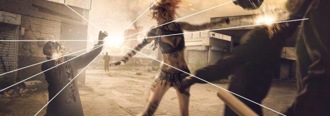

One last thing we picked on was the sword and how it got lost a little in front of the petrol station roof. If the right-hand side was gone, you would have better contrast to see the sword against the sky.
So with all these little compositional details in mind, we roughly (and I mean roughly) corrected them in Photoshop.

Even in this rough state of editing, the composition feels better. The flow of the image is more complete. The diagonals line up, creating more dynamic symmetry, and the sword stands out far more with the colour of the sky behind it. If we look at the arabesque, it definitely keeps your eye on the picture more. And with the eyesight of the henchman looking towards Shelly, it keeps you in the image, leading you around in circles which a good composition should do.


If you look at them together, the difference may be more noticeable.


Conclusion
So the point I am hammering home is that if I didn’t critique my own work, I would have never found any of this out. This was a lesson learnt that composition can always be better, and if you have the time, needs to be planned out in pre-planning just as much as everything else. At the end of the day, if you strip art back to its purest form. If you take out all the bells and whistles, you are left with composition. It is by far the most important factor in creating art.
Critiquing your own work is one of the best ways to grow as an artist. Don’t be afraid to acknowledge your mistakes. Remember, ‘When you aren’t winning, you are learning.’ And this is resoundingly true, every mistake is a lesson. So learn well!
FAQ
In photography, radiating lines are elements that draw the viewer’s eye outwards from a central point, like spokes on a wheel or sunbeams. These lines can be straight or implied, and they create a sense of energy, depth, and can lead the viewer to the main subject of the photo.
Lines are crucial in composition because they visually guide the viewer’s eye throughout the image. They can create a sense of depth, stability, or dynamism depending on their direction, and even evoke emotions. By using lines intentionally, you can control how viewers experience your composition.
Art composition analysis involves breaking down the artwork into its building blocks and how they work together. Consider the balance or dynamism, focal points that grab your eye, how your vision moves around the piece, and the closeness of elements. This reveals the artist’s choices and how they influence the overall feeling and message of the artwork.


