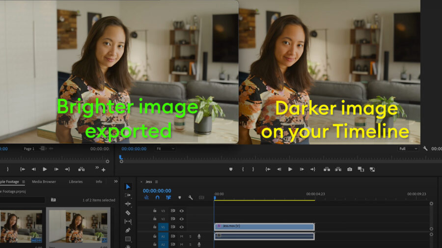
As creative professionals, most of us have likely run into this problem, and it is tricky to pin down – why isn’t the color of my video matching 1:1 between my export and my editing timeline? What the heck is going on? Is QuickTime somehow at fault? Is it my operating system? Or is it something else?
A few months ago, a friend of mine, Los Angeles-based Director of Photography Kevin Stiller, asked me if I wouldn’t mind giving him some feedback on something he was working on related to the infamous “QuickTime Gamma Bug” or “washed out” look sometimes associated with MacOS.
Here in our initial discussion, Kevin breaks down what’s happening in a way that’s concise, easy to understand, and made me believe our conversation would have value for others in our profession. If you are a cinematographer, colorist, editor, director, or any content creator who uses MacOS-based Apple products, you’ll want to give this video conversation and corresponding article a look.
What follows is written by Kevin Stiller as a companion to our video conversation.

What is it?
“Colors changing after export,” “QuickTime Gamma Bug,” MacOS video “washed out”… This dilemma has been called many different things causing frustration for professionals and hobbyists alike.
Today, I am going to break down one of the web’s biggest color-management mysteries and help us finally get to the bottom of this.
In this day and age, with the plethora of devices and certain manufacturers pushing the envelope of what displays can show us, we need to rely on some sort of mechanism that allows us to see content the way it was intended to be seen. The attempt to unify the tens of thousands of displays in the world is known as color management, and if you don’t know what’s going on under the hood, it can get tricky fast.
Many content creators, myself included, use Apple devices for their creative work. However, what most people don’t know is that MacOS has software running under the hood to manage every pixel that is shown on the screen in real-time. This process works well for the majority of us, but for certain scenarios, it can lead to unexpected results which cause hours of confusion and troubleshooting. For this reason, the remainder of this blog will focus specifically on MacOS and Apple displays. Even though color management is found everywhere, there’s something we must pay attention to, specifically when it comes to Apple.
Before I begin, I would like to highlight 2 key aspects of this topic.
- At the time of this writing in 2023, there is no one perfect solution that will fix this issue for everyone. However, if we educate ourselves and learn how to anticipate it, we won’t get so fixated on things we can’t control.
- No one is immune to this problem, and the fact that this is true will make more sense once we unpack this.
Color
The best way to discuss this topic is to separate it into two key components. Both of these components ultimately come together in the form of color management.
Since 2015, Apple has rolled out their P3 displays. P3 is a term used to describe a “color gamut,” or a description of how much color a display is capable of reproducing for you to view.
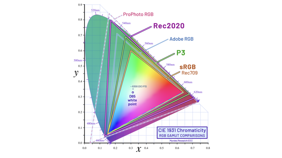
As you can see, there are different color gamuts to describe different displays. These are known as display-referred which means they are color gamut targets for deliverables. Rec709 is a great buzzword for us, because as filmmakers we hear this term quite often. Sometimes, we capture in Rec709, and other times, we capture in LOG and then use a LUT or color space transform to get our footage into the Rec709 gamut. We do this because the gamut has been a standard for quite some time. For now, a massive amount of web delivery and broadcast is mastered for this gamut, so we must pay attention to it, if that is our end deliverable.
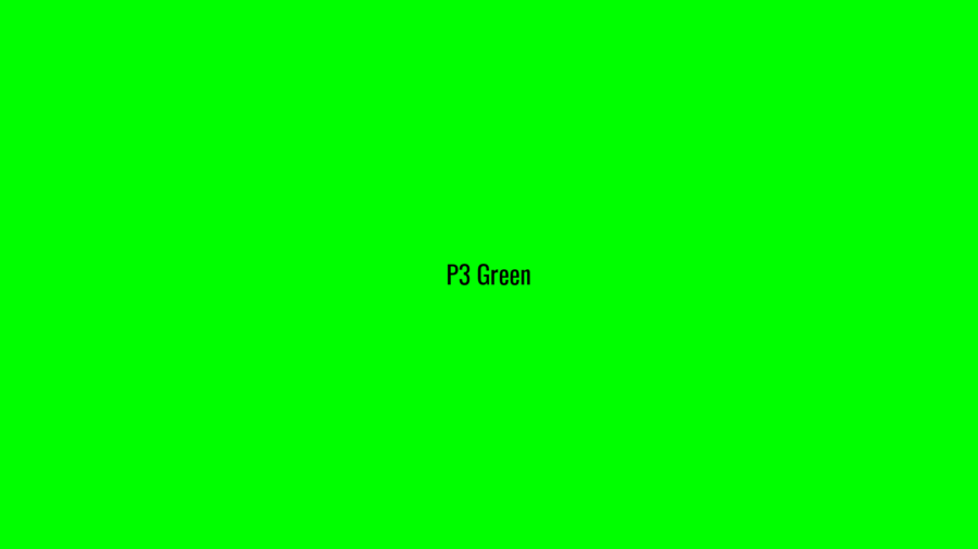
P3 and Rec709 are different color gamuts. And, because they are different, P3 doesn’t act like a “bucket” that can conveniently “hold” Rec709 colors. What this means is that 255 green on a P3 display is not the same thing as 255 green on a Rec709 display. Therefore, when a MacOS device needs to play back Rec709 content, it must be transformed on the fly in the background to reproduce the intended authorship of the image.
The images below will depict different shades of green in a color managed browser on a P3 display.
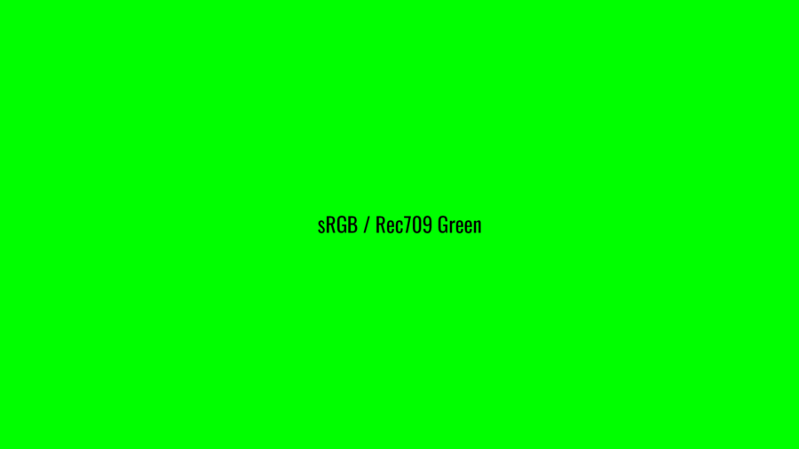
And:
The way MacOS does this is by utilizing a software known as color sync utility. Color sync utility interfaces with different programs in order to communicate information about the display profile set in your display preferences and also the application that is trying to play video content. When you use an application that can communicate with color sync utility, it will analyze the metadata of the video, refer to the display profile you have set in your preferences, and then convert colors for the proper intended viewing. When an application does this dance with color sync, it is referred to as a color-managed application. QuickTime and Preview are examples of color-managed applications. As of 2023, VLC is not colored-managed. Premiere and DaVinci are not color-managed… by default!
This is one of the key issues that creates a snag for folks. When you import footage into DaVinci or Premiere, by default, all settings are set to Rec709. So, unless you tell these NLEs otherwise, the assumption is that the footage you are editing or coloring is, or will eventually become, Rec709. If you are on an Apple display from 2015 onwards, which is in its stock P3 display profile, you are effectively watching Rec709 footage that has not been transformed out of the P3 color gamut. Therefore, the green and red colors that you see in your program monitor are going to be more saturated than they actually are! So, when that footage is exported out of said NLE and opened in a color-managed application … cough cough QuickTime… you are actually seeing the correct converted colors of that video. Premiere was, in fact, not correct in this scenario.
Please do keep in mind what I am describing is the “out of the box” experience for content creators with Apple devices. There are different workarounds to solve this issue of seeing incorrect colors in the program monitor – many of which are indeed quite simple and can be addressed in a variety of ways (all the way from hardware to philosophy!). However, before I dive into the solutions, it is time to discuss component number two, which is a much bigger issue known as the “QuickTime Gamma Bug.”
The Infamous “QuickTime Gamma Bug”
The QuickTime Gamma Bug’s real name is “MacOS AVFoundation assumes Rec709 content has been encoded with gamma 1/1.961” – a name obviously more verbose than the “QT Gamma Bug.” However, the reason for the real name is because QuickTime is not the only application on MacOS that will suffer from this problem. All color-managed applications will suffer from this. This means you could see this issue rear its head in Chrome, Safari, Preview, and more.
So, what exactly is “AVFoundation..Rec709…gamma..etc?”. The long story short is that MacOS is the only operating system that assumes we encoded our video with a gamma that is long since deprecated. Operating systems aside, mobile devices, TVs, cinema cameras, airplane entertainment systems – none of these devices do math based on the number 1.961. So, where does it come from and what is it? First, a quick review on what gamma correction is:
Gamma
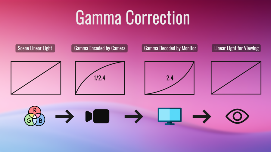
Gamma is, simply put, an input and output system of reproducing light on a screen. We use gamma to efficiently capture lighting, also known as Opto-Electrical Transfer Function (OETF) by leveraging imaging power towards recording more information in the shadow detail of images and less so in the highlights. This is because that is how our eyes see the world. Gamma is essentially a form of data compression, but done via light and voltage signals. If you have shot in LOG before, you are utilizing gamma encoding to preserve as much detail about the recorded scene as possible. Then later on in your NLE, the LOG footage is (usually) colored and graded to fit into a Rec709 space.
Devices that can reproduce Rec709 will then decode your image file with a gamma curve. This curve is known as an Electro-Optical Transfer Function (EOTF). As you can see, OETF and EOTF are the inverse of one another. The total effect of gamma from capturing what your eyes saw, to seeing it on a screen, (the net result of the OETF and EOTF), is known as “system gamma” or “OOTF”(Opto-Optical Transfer Function). It is typical to home base around a system gamma of 1.0, so that light is put into a linear space which is easier to do math on resulting in a 1:1 reproduction of light as it was captured. However, we can manipulate the system gamma to target optimal viewing in different situations ranging from offices to cinemas.
A straightforward way to view this workflow is the following:
A cinema camera that is filming in LOG outputs a LOG to Rec709 Gamma 1/2.4 video signal so you can monitor on set. -> The file is displayed on a reference monitor that is set to decode as Gamma 2.4. The net result is a system gamma of 1 because 1/2.4 and 2.4 are the inverse curves of one another.
Gamma 1.96
Gamma 1.96 has a long and interesting history. Gamma 1.96 has been around for many decades and broadcast cameras used to encode with this OETF. Unlike today where we have a plethora of devices with different display gamma curves, in the 40s, 50s, and 60s, the general population only had CRT TVs. CRTs have a gamma curve baked into them defined by their physical voltage and chemical properties and not via software. CRT monitors roughly had a gamma of ~2.45. This means in order to display content on a CRT exactly the way it was seen with our eyes, you would want to encode a video file with the inverse of that gamma curve. So: 1/2.45 = .42. This would then result in what’s known as a system gamma, or, the “net effect” of your input and output gamma, of 1.0. 1.0 system gamma is a good starting place because you will then have linear light. But, linearizing light was not enough for broadcast engineers.
Experts realized that CRTs were typically watched in dimly lit environments. This means that dark shades will appear brighter due to an optical illusion, or phenomenon, known as the simultaneous contrast effect.
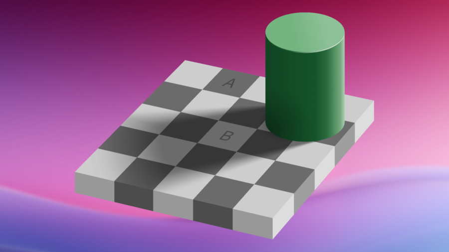
Above you can see this “glitch” in human perception. The two squares above are exactly the same shade but appear different based on their surrounding environments. So, when we watch content with a dim surround, dark shades appear brighter which produces a less desirable image. Therefore, rather than changing the engineering on CRTs across the globe, it was simpler to “bake in” this dim surround contrast boost on the broadcast camera side by recording footage in gamma 1/1.96 rather than 1/2.45.
The math works like this:
X (desired encoding gamma) = 1.25 (desired system gamma with contrast boost) / 2.45 (average CRT gamma)
X = 1.25 / 2.45
X = .510
.510 = 1/1.96.
Thus, 1/1.96 was used to bake in the gamma of video content for many years and then in the early 90s, Rec709 was officially written, formally defining a “camera gamma” of 1/1.96.
So, what is MacOS doing?
Now that there is an understanding of the magical number 1.96, I will tie it all back together with MacOS. MacOS refers to the original white papers of Rec709 which defines the encoding gamma. Therefore, MacOS (AVFoundation..) thinks the math goes like this:
Rec709 video file was encoded with gamma 1/1.96. Invert this gamma curve to obtain linear lighting of 1.0, then convert it to the display profile’s gamma curve which is gamma 2.2 (By default). The resulting file would theoretically be correctly reproduced if we did encode our Rec709 file as gamma 1/1.96. However… we don’t. No one does anymore!
Professionals, content creators, videographers, and enthusiasts alike, all target gamma 2.4 or 2.2 as a delivery gamma. So, we target our encoding for that. In 2011, Rec709 was amended by BT1886 which (finally) defined a display gamma of 2.4. Gamma 2.4 has been our target gamma delivery for many years.
To break it down into steps:
- A Rec709 video graded in 2.4 reference environment is opened in a color-managed software.
- Software announces to Color Sync it is Rec709.
- Color sync interprets the video as gamma 1/1.96. Attempts to linearize the gamma with inverse gamma function 1.96.
- The more appropriate inverse function would have been to use 2.4. The resulting gamma is not fully linearized as the user anticipates.
- Color sync references currently enabled ICC profile. Sees sRGB gamma 2.2 (assuming stock XDR P3 profile or “Color LCD”).
- Applies a linear to 2.2 transfer function.
- Resulting image perceived by the eye on an apple display is a gamma value lower than 2.2 and thus the infamous “QuickTime Gamma Bug.”
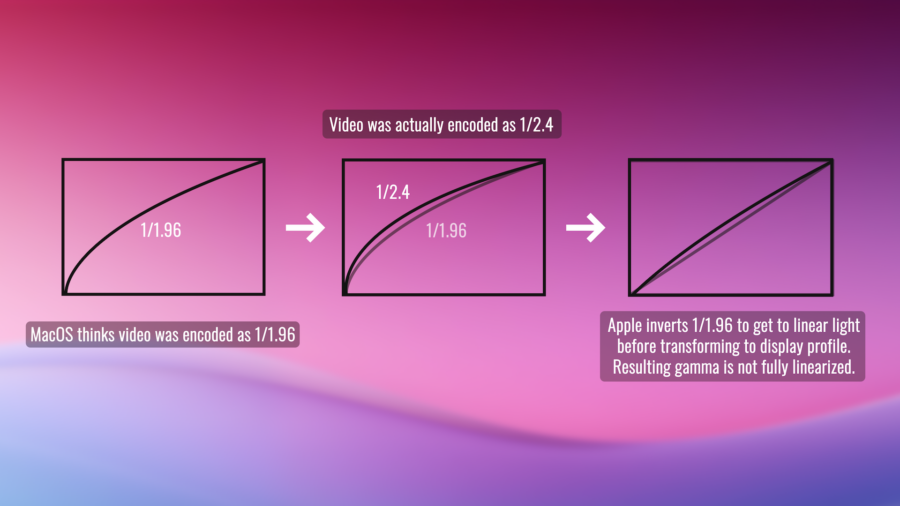
Apple particularly likes the mismatched gamma that we refer to as the QuickTime Gamma Bug, because the resulting file appears brighter which helps viewers observe content in an extremely bright surround environment. The dilemma here is that many people simply don’t watch video files with ambient light levels high enough to compensate for this degree of the simultaneous contrast effect. Plus, not even iOS does this, which adds to the confusing intent behind this ordeal.
What can I do about this?
At this point, we must be asking ourselves what we can possibly do about all this. Let’s explore our options:
Before recommending any software-based workaround, I must strongly recommend bypassing the operating system entirely. Instead, output your video feed through an I/O device into a calibrated reference monitor. This is the most common professional workflow that will ensure what you see is what you get. Anything other than this will not guarantee you consistent and reliable results. However, if that is something that the budget cannot afford, read on for the next available options.
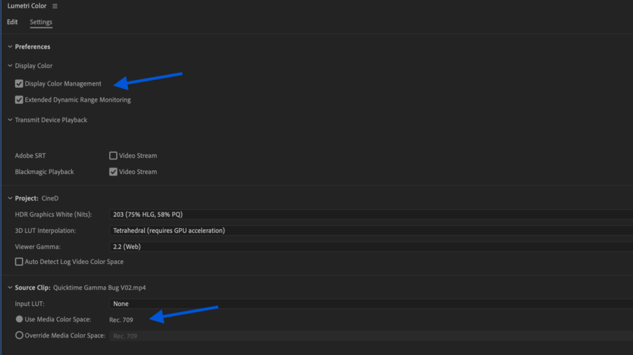
If you are editing on an Apple display and want to see the correct Rec709 colors of your video, enable display color management in your NLE.
In Premiere, the Lumetri settings panel will allow you to enable this. Find the check box named “Display Color Management” and enable it. Below this you can set your working color space to be Rec.709. (In older versions, it is located in the general settings menu and assumes Rec709)
In DaVinci, enable “Use Mac Displays as Viewers”. Then, close and reopen DaVinci. In DaVinci’s color management tab, set your output color space to Rec709 Gamma “x”. X being your desired display gamma.
This simple fix will result in seeing accurate Rec709 colors in your program monitor on these popular NLEs. However, I still need to address the gamma bug.
While you can monitor in different gamma settings, it is absolutely critical to remember that MacOS is the only platform that assumes Rec709 has been encoded with 1.96. This means no matter how hard you try, there are zero one-size-fits-all solutions. What you can do though is target your audience with all this in mind. If you want Premiere or DaVinci to show you what your footage will look like in a color-managed application, change your viewer gamma in Premiere to be 1.96 (QuickTime). For DaVinci, set your output color space gamma to be Rec709-A. The A stands for Apple :).
Until the software update that fixes all this happens (we can hope, right?), I personally do not recommend coloring or grading footage while watching footage with this gamma due to the fact it is so untraditional.
What I do recommend, though, is setting your viewer gamma to be 2.2. I find this to be the most “goldilocks” solution but only if not using an I/O device or a professional color workflow. In this situation, it’s likely the content is being delivered for the web. Do not do this if you are delivering for cinemas or television. You are still going to see a gamma shift in color-managed applications across MacOS, but it will be less than before and you now fit the criteria of having a traditional gamma for the rest of web browsing devices across the world.
All Washed Out
Whew – That’s it! If you made it this far, I truly congratulate you. This can be a dense topic with lots of jargon and unfortunately, that’s the state of the industry right now. As mentioned, many folks such as myself are eager for the day Apple changes this with a software update. But for now, the best philosophy we can all have is that once something has left our hands, it is simply out of our control and into the Wild West.
If you would like to improve your comprehension of gamma and color management, here are two resources I found to be particularly helpful along the way:
https://www.cambridgeincolour.com/tutorials/gamma-correction.htm
https://poynton.ca/notes/colour_and_gamma/GammaFAQ.html
Lastly, I want to give a profound thank you to Caleb Carges who has dedicated themselves to the study of colorimetry and specifically the Quicktime Gamma Bug. Without them, this article would not have been possible as they are a key pioneer to the public understanding of this topic.
Take care and see you next time!
Additional video assets were downloaded from Flaticon. Credit below:
Laptop icons created by Good Ware – Flaticon
Video icons created by Freepik – Flaticon
Rgb icons created by Freepik – Flaticon
Video camera icons created by Kiranshastry – Flaticon
Rgb icons created by Freepik – Flaticon
Television icons created by Freepik – Flaticon
Eye icons created by Kiranshastry – Flaticon


