Technology is constantly evolving, and with it, software must follow. While Apple’s approach towards pushing a new update every year in MacOS and iOS is a bit much, Microsoft’s six-year gap between Windows 10 (2015) and Windows 11 (2016) is much more reasonable. Yet even then, the company cannot escape the constant scrutiny regarding the shortcomings of its latest operating system.
Windows 11 makes some great changes, like its revamped notepad or easy-to-use snap window feature, but it also removes functionality in some areas and unnecessarily complicates things. Please Microsoft, listen to our complaints and fix the mistakes of this generation. Without further ado, here are five reasons I hate Windows 11.
1. File Explorer Address Bar barely works
When it comes to how I use Windows, I’m a bit of a tinkerer. Beyond just having deep libraries of game downloads strewn across five different storage devices inside my computer, I’m also a frequent modder, and whether it’s for “Dragon Ball FighterZ” or “Lethal Company,” I enjoy the convenience of quickly moving files between folders.
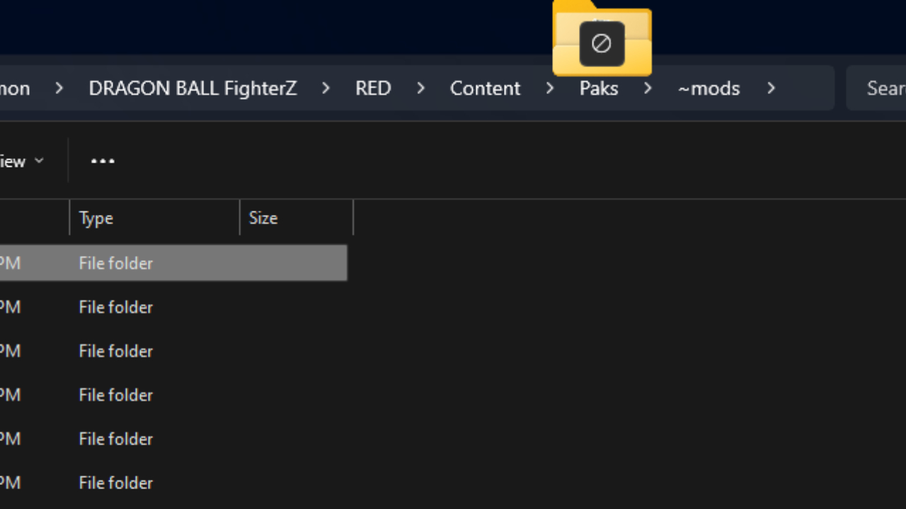
Unfortunately, the Windows 11 File Explorer makes this impossible. Whereas in Windows 10, being several files deep inside of the Address Bar allows me to grab a file from within a folder and move it into any one of the previous folders located in its string, Windows 11 straight up does not have this functionality. Hovering a file over this section doesn’t do anything. I cannot think of a single reason why this was removed.
2. Important File Explorer options are buried
Windows 11 made a controversial change by incorporating a new menu when users right-click on an item inside File Explorer (or on the Desktop). Rather than immediately listing all of the available options, a minimalistic version of what Microsoft believes would be the most popular options is shown in the initial menu. To view more of these items, the user must click “Show More Options” at the bottom to reveal the original menu from Windows 10.
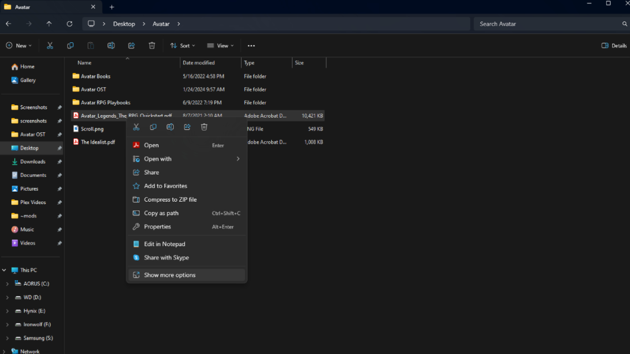
Not only does this reduce the number of visible options, but a good few of those options, including Cut, Delete, Rename, Share, and Copy are now just icons. New users to Windows 11 might not even notice their presence, and for the first few weeks, you might have to hover over them to see their name pop up before knowing what you’re clicking.
Microsoft’s striving for a more approachable, minimalist user experience is understandable, but fracturing options into two different menus will only confuse users more, especially if they’re not aware of the secondary menu and can’t find the option they need.
3. Inconvenient Volume Mixer
Windows 10 featured a separate volume button easily accessible through the taskbar. Right-clicking it and selecting the volume mixer brought up a convenient group of audio sources. Windows 11 removes that dedicated button and instead couples it into Quick Settings, which feels like nothing more than a pointless removal of functionality.
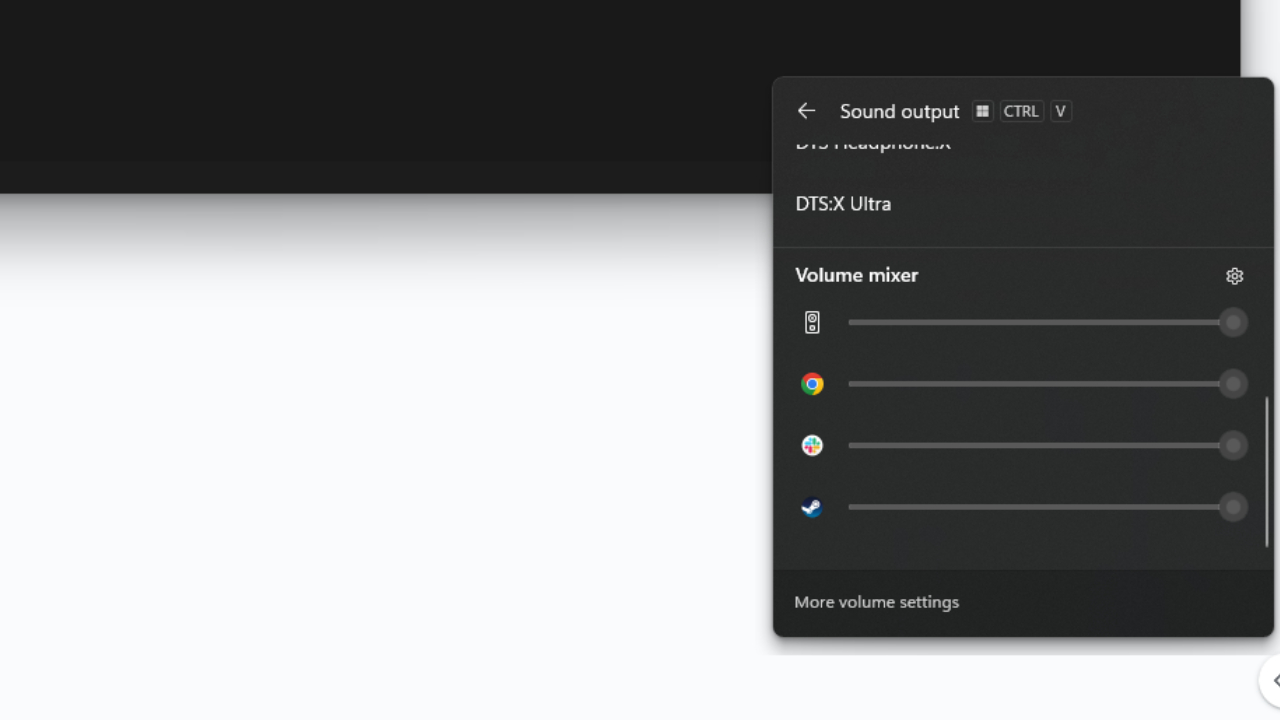
Now the user has to click the Quick Settings menu, go to “Select a Sound Output,” and then scroll all the way down through the available outputs before reaching a horizontal volume mixer.
4. Default apps is a mess
The Default Apps page is used to make certain file extensions automatically open through a user’s desired application. For example, making Google Chrome the default browser is something many people do when first opening Windows.
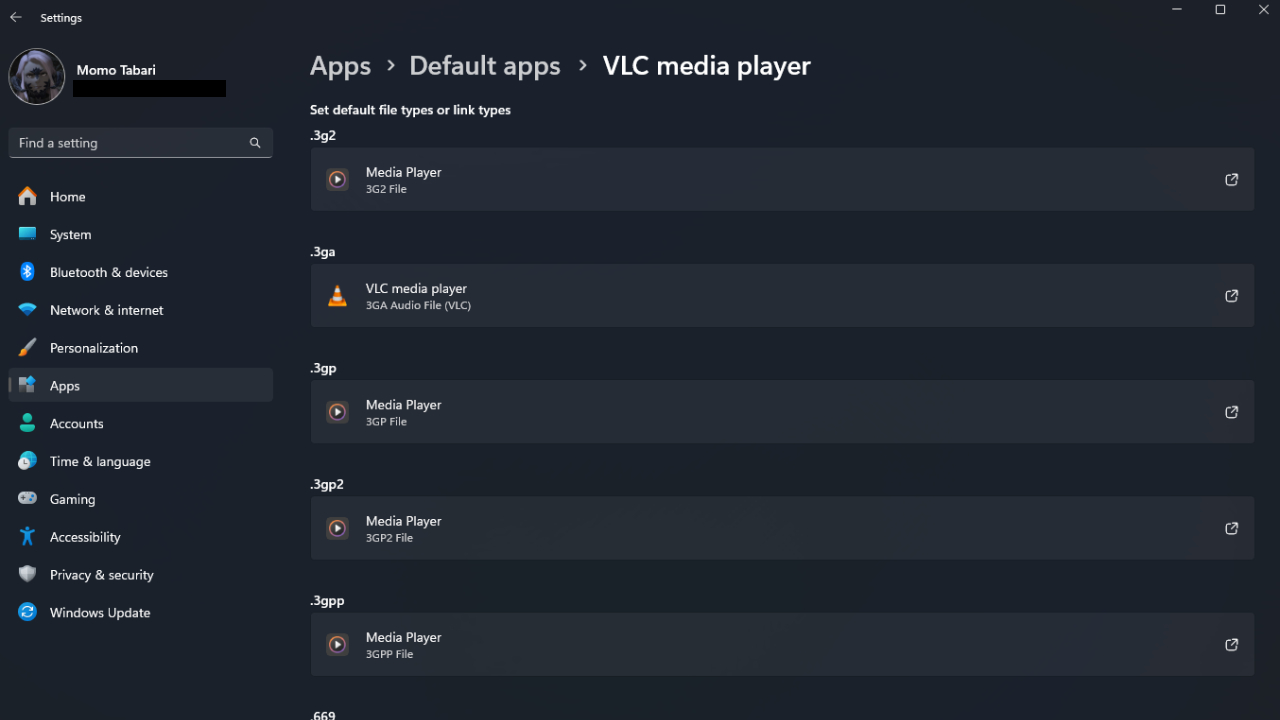
But Windows 11 makes this process far more complicated than it used to be. The default applications page now features a massive list of all the user’s downloaded apps, and when clicking on the apps themselves, an enormous collection of file extension types becomes visible.
While this level of minute detail is useful for some, having it be the main screen most users encounter is bizarre. The simplicity of selecting the default application for general Photos, Music, Maps, and more was user-friendly, whereas this is nightmarishly complex. The existing Windows 11 menu should be part of some “Advanced” section rather than the default way of handling it.
5. Still no handled gaming mode
While not necessarily a criticism of Windows 11 compared to Windows 10, I have to express my displeasure towards Windows’ lack of navigability on a gamepad. With the recent launch, and quickly heightening popularity, of systems like the Asus ROG Ally and Lenovo Legion Go, with the MSI Claw coming out relatively soon, it’s time for Windows to accommodate these systems beyond just forcing us to use a joystick to control a cursor.
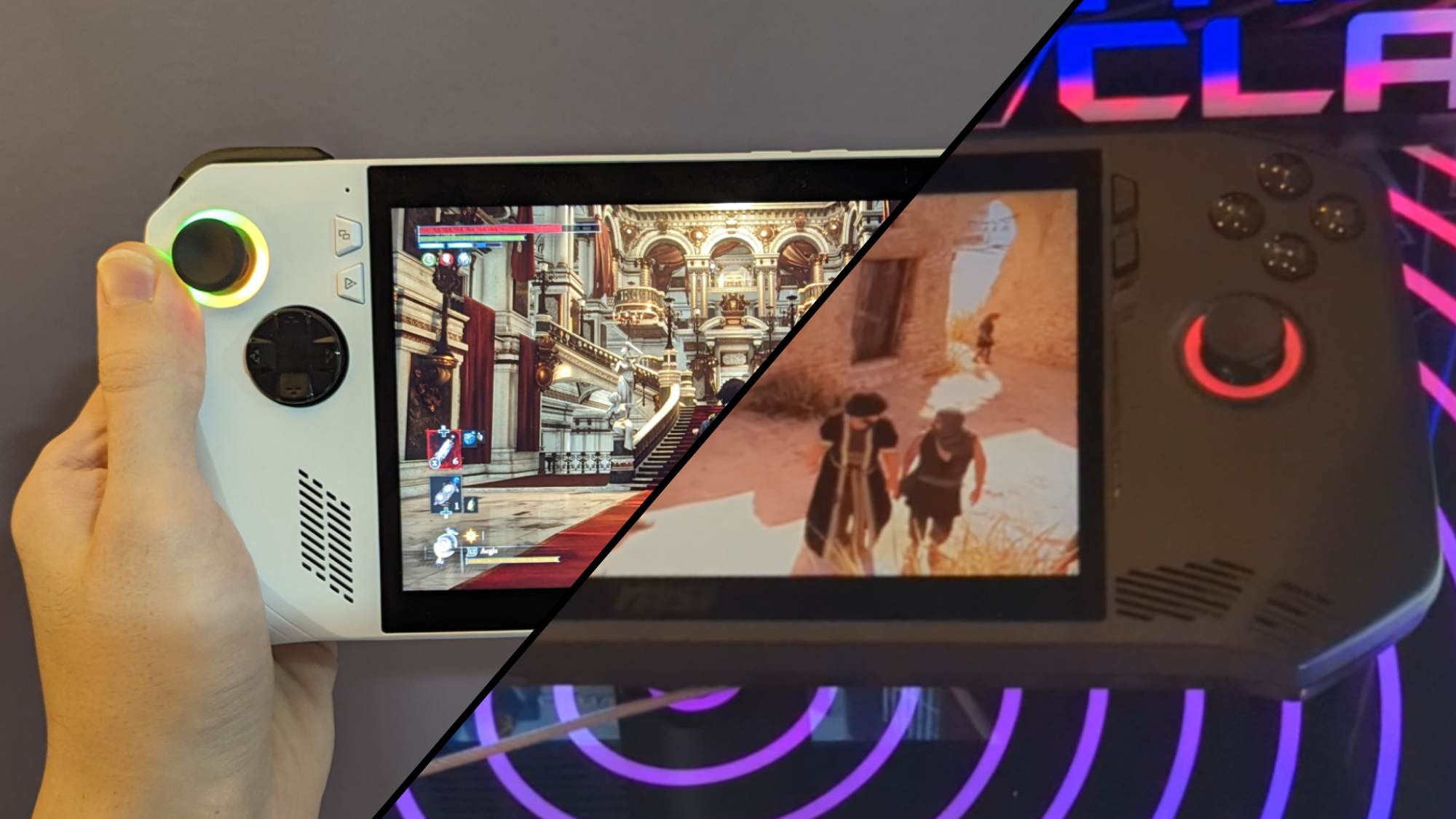
Windows having a separate launchable operating mode that behaves like a game console’s UX sounds delightful, and considering that Xbox already has years upon years of experience in developing UI, it would be great if they could work with the Windows team.
As much as I love my Asus ROG Ally, it’s a constant battle against Windows 11 when I’m not gaming. And even while gaming, the occasional slowdowns, bugged functionality, and progress-eliminating freezes that happen when putting the device to sleep happens more often than you’d think.
In this hypothetical gamepad-friendly mode, Windows cannot just be presented to the user differently. If it’s built upon the same fundamental system, the lack of necessary features will keep it far below the expectations of a traditional game console. The most important would be the seamless ability to resume games even after the handheld is put to sleep.


