As an optical system engineer working with telescopes, microscopes, or lenses, it’s important to know how to read a lens spot diagram.
With this tool, you can tell whether the image produced is accurate or not, which will help you adjust the lens accordingly.
In this article, I’ll tell you what a spot diagram is and how to read it. I’ll also explain what IMA and RMS mean on spot diagrams.
What Is a Lens Spot Diagram?

Fabian RRRR, CC BY-SA 3.0, via Wikimedia Commons
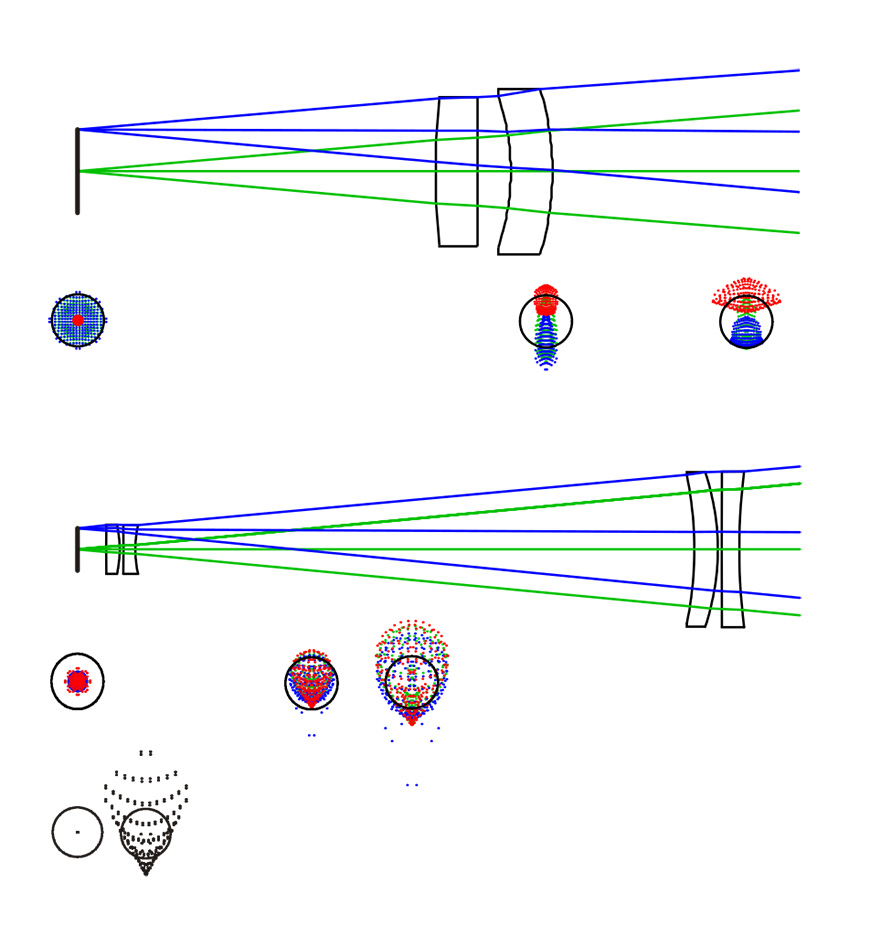
A spot diagram is a graphical representation of the performance of an optical system. With just a glance, you can read the analysis of the image quality at a better accuracy than what the human eye can see.
In essence, a lens spot diagram shows where the rays from the object fall on the image surface. The closer they lie to each other, the better the picture quality.
A typical lens spot diagram has a bunch of dots that form distinct shapes, numbers, and abbreviations. I’ll explain those in a moment.
There’s also a small black circle in the middle of each shape called an airy disk.
These components of a spot diagram tell you about the optical performance of the system.
In short, a lens spot diagram shows how accurate the image produced is compared to the object.
What Are Lens Spot Diagrams Used for?
Lens spot diagrams are used to correct inaccuracies in the optical design of lenses. They’re used to evaluate coma, distortion, astigmatism, spherical aberration, chromatic aberration, and other optical properties.
By analyzing a spot diagram, you can determine the quality of the image produced by the lens. This is important in fields that use lenses, like photography, astronomy, and microscopy.
As a diagnostic tool, spot diagrams can be effective when comparing the performance of various optical systems.
However, using a spot diagram is not enough to assess image quality because it has its limitations. For example, if there’s a large wavelength error, the results won’t be accurate. You can use the Strehl Ratio to correct this shortcoming.
Additional tools for analyzing and correcting lenses are Seidel diagrams and optical path difference (OPD) plots.
How Do You Read a Spot Diagram for a Lens?
In reading a spot diagram for a lens, you need to understand the different elements of the entire image.
The shape, size, and distribution of the spots indicate the quality of the image the lens has produced.
To read a spot diagram, follow these steps:
1- Locate the Optical Axis
The optical axis is the line that runs through the center of the lens and the center of the image plane.
The optical axis is usually represented by a vertical line in the center of the spot diagram.
2- Identify the Focal Point
The focal point is the point where the rays from an object converge to form an image.
The focal point is usually represented by a horizontal line at the bottom of the spot diagram.
3- Examine the Size and Shape of the Spot Diagram
The overall size and shape of the spot diagram indicate the optical quality of the image.
How Much Do You REALLY Know About Photography?! 🤔
Test your photography knowledge with this quick quiz!
See how much you really know about photography…

A small, compact spot diagram indicates a sharp, high-quality image. A large, diffuse spot diagram indicates a blurry, low-quality image.
4- Identify Any Aberrations
Aberrations are imperfections in the lens that cause light to be deflected from its ideal path.
The most common aberrations are spherical aberration, coma, astigmatism, and field curvature. These aberrations will cause the spot diagram to be elongated, distorted, or off-center.
How Can You Identify Different Aberrations in Lens Spot Diagrams?
Light rays are ‘supposed’ to move in straight lines and meet at a focal point. But in reality, some can move haphazardly, straying from their normal path into the surrounding field.
Optical aberration is a lens defect that causes light rays to scatter instead of coming together neatly to form a sharp image. In lens spot diagrams, aberrations can indicate the deviation from the ideal performance of the optical system.
These defects can cause blurring, distortion, and other image quality issues.
Below are some common aberrations and what they look like on a lens spot diagram:
Coma
This aberration is easy to spot as it looks like a comet. It causes off-axis objects to appear blurry. You can correct this defect by adjusting the shape of the lens.
Spherical Aberrations
You can identify a spherical aberration by looking for dispersed dots that form a uniform circle. They can be dense at the center or on the edge, depending on where the light refracts along the focal plane.
Chromatic Aberrations
By far the prettiest, chromatic aberrations look like colorful shapes on a spot diagram.
The way the wavelength of light refracts causes this irregularity. This appears as colorful dots infringing around the edges.
The human eye can detect green and red light better than blue and violet. So, chromatic aberrations can be particularly noticeable in those colors.
Astigmatism
In astigmatism, an object that’s not lying on the axis produces an image that looks elongated and stretched in one direction.
You can correct this distortion by adjusting the shape of the lens.
How Can You Use Spot Diagrams in Photography?
Spot diagrams in photography are an essential tool to evaluate the performance of a camera lens.
That’s because they help you understand how light rays focus when passing through the lens and appear in different parts of the image frame.
With a spot diagram, you can determine the sharpness, contrast, and distortion levels of a lens. This information is critical for photographers who want to create top-notch photos that are free from optical issues.
By understanding the physics behind lenses, you can capture the perfect shot that’s in sharp focus.
You can read about the Circle of Confusion (CoC) to learn more about this concept.
What Is the IMA in a Spot Diagram?
IMA indicates the position of the intersection on the imaging surface. The abbreviation stands for Image Mean Angle.
IMA is a measure of the angle between the optical axis of the lens and the image produced. The value of IMA can be positive, negative, or zero.
When this value is zero, it means that there’s no distortion in the image. This is the ultimate goal when optimizing your optical device.
If the IMA is positive, the distortion is in the direction of the optical axis. But what if the distortion is in the opposite direction from the lens’s optical axis? You guessed it, the value of IMA becomes negative.
What Is the RMS in a Lens Spot Diagram?
RMS is short for Root Mean Square, and it’s a measure of the amount of blur in an image spot. The RMS helps to evaluate the spherical aberration of the lens.
If this value is zero, it means that there’s no spherical deviation in the image. Similar to IMA, RMS can either be a positive or a negative number.
When RMS is positive, the image is distorted in a convex shape. The opposite is true in that if the RMS is negative, the image is distorted in a concave shape.
To remember this rule easily, think of convex and concave lenses in relation to enlarging or shrinking an image. Convex lenses make things look bigger, hence positive.
Take the HARD Photography Quiz! 🤯
Now it’s time to really test your photography knowledge!
(99% of people can’t get all the questions right…)

Conversely, concave lenses cause objects to appear smaller. Therefore, RMS is negative.
Back to aberrations, a lens with a low RMS will produce a sharper image than a lens with a high RMS.
FAQ
What is the difference between a lens spot diagram and a Seidel diagram?
We can use both lens spot diagrams and Seidel diagrams to evaluate the performance of lenses. While a lens spot diagram is the graphical representation of the image quality of a lens, a Seidel diagram is the mathematical depiction of the aberrations of the lens.
What is the difference between a lens spot diagram and an optical path difference (OPD) diagram?
Both lens spot and OPD diagrams are visual representations used to evaluate lens performance. Lens spot diagrams show the image quality, while OPD diagrams tell the phase difference between light rays passing through lenses.
What is the OPD plot?
An optical path difference plot is a graph used to represent the phase difference between the light rays that pass through the lens. This plot is important to evaluate the performance of lenses and to correct for aberrations in the optical design.
What is the difference between a spot diagram and Point Spread Function (PSF)?
Point Spread Function is a mathematical operation that describes how a point source of light is dispersed by the lens. The main difference between a spot diagram and a PSF is how image quality is displayed.
Spot diagrams show distinct points in the image plane, while point spread functions appear across the entire picture.
How do you calculate the Strehl ratio?
The Strehl ratio is a measure of the image quality that a lens produces. You can calculate this value by comparing the peak intensity of the PSF your lens produces to that of the ideal number from a ‘perfect’ optical system.
The value of the Strehl ratio lies between zero and one, where one indicates perfect image quality.
What is a good Strehl ratio?
The range of the Strehl ratio is zero to one, whereby the greater the number is, the better the image quality. Generally, a ratio of 0.8 or more is considered good. As for numbers below 0.5, they can be acceptable in only some applications, but not all.
Highly Recommended

Check out these 8 essential tools to help you succeed as a professional photographer.
Includes limited-time discounts.


