The IGF (Independent Games Festival) aims to encourage innovation in game development and to recognize independent game developers advancing the medium. Every year, Game Developer sits down with the finalists for the IGF ahead of GDC to explore the themes, design decisions, and tools behind each entry. Game Developer and GDC are sibling organizations under Informa Tech.
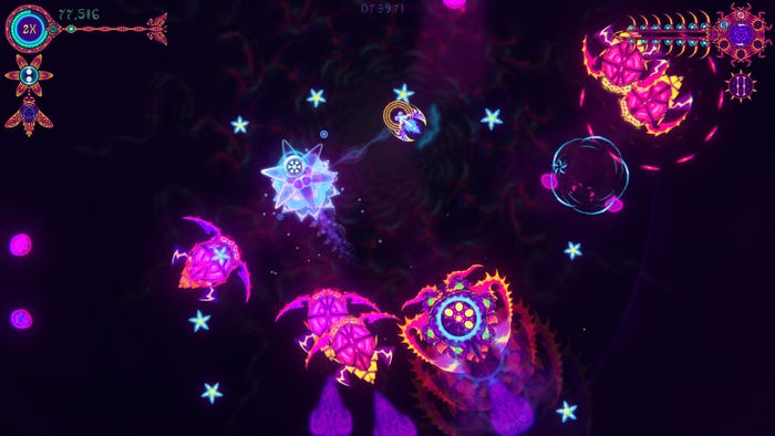
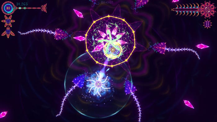
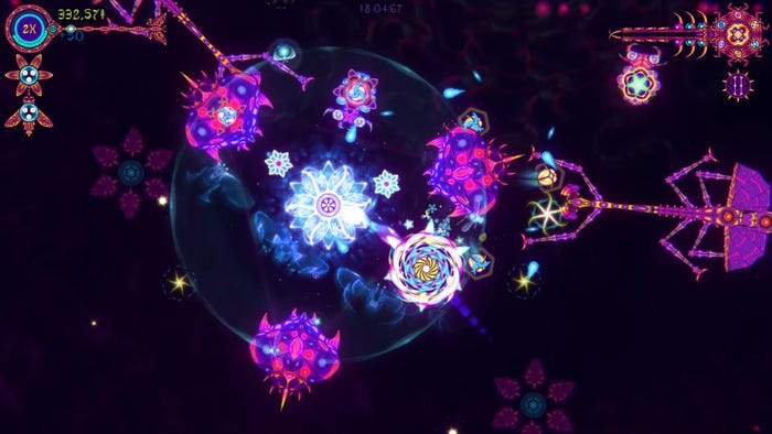
NIDUS sees players guiding the symbiotic relationship between a flower and wasp as they blast psychedelic wildlife in order to survive.
Game Developer caught up with Caleb Wood, developer of this colorful Nuovo Award-nominated experience, to talk about how they used two connected characters to weave tension into the top-down combat, how they would take inspiration from (but also reshape) insects in nature to create impressive creatures and enemies, and how they had to wrestle with their own design desires in order to keep from overwhelming players with the visuals.
Who are you, and what was your role in developing NIDUS?
My name is Caleb Wood and I’m the solo developer of NIDUS.
What’s your background in making games?
NIDUS is my first game, but before starting it I got introduced to the process of making games by Brian Gibson. I made some art for a prototype project with him, and that was my first look at seeing how games are put together.
My real background is in drawing and animation. I’ve been making short films and music videos for around 15 years now. I always wanted to try to make a game and be able to give some new life to my animations, but it was always a very intimidating prospect to start. But after being introduced to it, I got pretty addicted and wanted to give it a shot.

Images via Caleb Wood.
How did you come up with the concept for NIDUS?
Because NIDUS was going to be the project where I’d teach myself so many different things, I wanted it to be a fairly simple arcade game. That seemed like something I could wrap my head around at the time, and those are the kinds of games I gravitate towards when I’m looking to play something.
The first idea out of that was to make a game where the player would be a flower and you’d have to avoid enemies and attempt to grow. Over time, I got interested in different ways of allowing the player to avoid things, but also be able to collect and attack, and that sort of morphed into the player character being split into two unique pieces. Once I had the player split in two, the idea of symbiosis solidified a lot of what the future development would be. Now there was a relationship between these two pieces—a flower and wasp—and the game became a strange arcade version of pollination.
What development tools were used to build your game?
I used Unity to build it. All of the art and animation is drawn in photoshop, and I picked up FL studio to make sound/music.
NIDUS features a striking hand-animated visual style. What inspired the look of this game? And can you tell us a bit about your process in animating these vibrant creatures?
I’ve been making intricate animated loops for a while now. I’ve made a few short films that are just large loops that the camera pans over. So, when making NIDUS, I wanted to bring some of that constant looping/morphing motion into the game. The game’s enemies were always bugs that would want to eat a flower, so I just tried to make really strange and mesmerizing animations for them and have fun with it.
The process of animating them is very simple, just tedious. I animate small details at a time, doing several passes on a piece, that ultimately culminate into elaborate moving patterns. Here’s an example of my process.
The game appears to draw heavily from natural life. Can you tell us a bit about the real-world plants and creatures that inspired the game? How you took those real-world things and shaped them for the game?
A lot of the design decisions usually felt better to me if there was a real-world counterpart that I could look at in nature. Throughout development, though, some of these decisions would go through changes and make some jumps away from that starting logic. Wasps are natural pollinators of flowers, and some wasps also have some parasitic behavior with how they reproduce by laying eggs onto other insects. I implemented a mechanic where the player wasp could embed eggs into enemies, but later gave that ability to the flower instead as it gave the overall gameplay much more balance.
Some of the enemy insects’ visual designs are very close to real insects, like the sawtooth treehopper or a stick bug. These specific bugs had a form that fit well with the game’s requirements and provided something unique. But, overall, most of the enemies are just inspired by the cool factor of insects and are more about facilitating certain challenges to the player.

Images via Caleb Wood.
What drew you to create two separate things the player must guide—the defensive flower and the attacking wasp? Why give the player these differing elements they have to juggle together?
The decision to split was sort of based on providing a unique gameplay challenge to a common format of top-down arena survival. In a 3D arena game, the player has a certain range of awareness that falls into their field of vision. So, everything behind the player or outside of the field of view puts a ton of tension on the experience. But in most 2D games, the player has awareness of everything around them, and you don’t get that same sense of tension. By splitting the character in two, attack and defense, suddenly now your awareness becomes much more challenging to maintain, and that tension of impending threat can thrive. You have to keep track and manage what threats are near your flower, while also flying your wasp away to take out priority targets.
I love challenging games, and I love games with strange input, so once I started testing “split-stick” gameplay, I really enjoyed it. I wasn’t very worried about whether there were other people who would enjoy it. I was just having fun, learning, making mistakes, and barreling forward with the project.
What thoughts went into designing how the flower and wasp would each behave in combat? Into designing how they would need to stay connected, and how that connection would be necessary during play?
Symbiosis was definitely a strong cornerstone that I leaned on for figuring out those design choices. Pollination made a lot of sense for what I was trying to pull off. I wanted a short, quick gameplay loop, where the player would have to separate their characters, perform some actions, and then reconvene. So having the wasp fly out, attack enemies, collect some items, and finally deliver them to the flower fit perfectly.
Figuring out the flowers’ gameplay roles took longer and much more iteration, because it already had the critical role of being the player health pool. I eventually landed on a few supportive and risk-reward mechanics for it, like marking enemies and applying some buffs to the wasp. But the big revelation was having an explosive ability trigger when the wasp delivers its gathered items to the flower. A fireworks type of pollination—that really reinforced the whole gameplay loop and provided all sorts of unique potential.
What thoughts went into designing enemies and attack patterns around the players’ differing, connected abilities? How did you challenge them on both fronts using your foes?
Throughout its development, it became clear that the challenge enemies needed to provide was that of making the player manage the separation of their two characters. So, this took the form of having multiple weak spots on enemies that the wasp would have to destroy while giving a form to the enemies that was dangerous for the flower. This got reinforced later by introducing a type of weak spot that had to be exposed by the flower before the wasp could damage it.
The last type of challenge was providing an obstacle that the wasp would need to navigate around. So, I implemented some enemies that can basically disable the wasp on touch, and then the wasp needs to return to the flower to be useful again.

Images via Caleb Wood.
What thoughts went into keeping players from getting disoriented by the visual style while playing through the game? How did you work to preserve your visual style without making it hard for players to know what was going on?
Having a visual tether between the two characters helps a lot in keeping players aware of their positioning, and introducing a maximum distance that the characters could travel from each other really keeps things grounded. Many players still do get disoriented by the prospect of moving two things, and can easily go into cognitive overload. In many ways, that’s part of the challenge that NIDUS provides. It’s a unique type of input that requires the player to rewire their brain a bit, like learning how to drum with all your limbs.
It was difficult to preserve my own aesthetic preferences in a game that challenged the player to keep track of so many things. In the end, I toned down quite a bit of animation to be more readable, which goes against my own instinct to just make things look as wild as possible. That was a hard pill to swallow, because throughout my entire animation career, I’ve never once worried about readability or communication at all. I just make stuff that sort of comes out naturally, so the process of making NIDUS was very much an internal wrestling match where I had to tame my creative beast. That said, it’s still a very wild visual style, and ultimately adds to the tension of controlling your awareness while playing.
What appealed to you about adding local co-op to this experience? How do you feel this makes things easier for the two players? How do you feel this can actually make things harder for them both?
Local co-op was a nice gift that never even crossed my mind for a good stage of early development. At one point during a playtest, I told two younger players that they could just hold on to different sides of a controller and play together, and they got really into it. After that, it was pretty clear that this was a very valid way of playing the game, and the prospect of it being co-op sort of strengthened the need for the two characters to have very unique roles.
Co-op will always bring a unique challenge, regardless of what game you’re playing. You are depending on another brain that you have no control over. This is what makes co-op fun—the bond between players and the attempt to collaborate and communicate. For a game about symbiosis, it clicked in nicely; if you both don’t perform your roles you will both fail.
NIDUS can get increasingly more challenging if players want it to. What thoughts went into making things more difficult in this game? How do you shape difficulty so that it feels harder without getting “unfair”?
All of my thoughts during development were focused in the opposite direction. “How can I make this more accessible, how can I make this more approachable to new players, how can I make this more satisfying to play?” The basic concept of the game is already very difficult, and the early versions of the game are much more difficult than what it eventually rested into. It took awhile to really find a balance where things were very forgiving in comparison, but could still provide a high sense of tension and payoff.
At the end of development, I brought back some of the intensity of its earlier iterations as unlockable modes. The only difference between the modes is how much damage the flower takes when getting hit alongside a score bonus, with the hardest mode being one hit death. This is what the game was like when I first started prototyping it, and it is still the most intense version for me to play. If the game really clicks with someone, then they can work their way up to unlocking that difficulty by beating each previous mode.


