Intro
Forecasting in video games refers to how much resource we think a particular project, milestone or task will require and how much time it will take. Through a combination of data, experience of the team, creativity and (probably more than we’d care to admit) luck, production teams are becoming increasingly able to balance people vs product, and more accurately prepare for the long journey of making a game.
If you forecast incorrectly for resource, you may find your teams burning out as the demands of workload flood your available capacity. Or forecast incorrectly for time and you might find yourself on the receiving end of some very frustrated stakeholders.
Luckily, there are data gathering practices, tools and techniques developers can use to ensure their forecasting is as pitch perfect as possible. Here, I’ll break down just some of the ways developers can level up their forecasting.
Correct data gathering practices
At the start of a project, it’s important to learn from where you’ve been, and identify how you can use your experiences to improve ways of working, implement best practices and support development teams.
One of the best ways to get started is through data gathering. When a project starts, it’s good practice for a production team to start their forecasting journey with transparency: the development team will be your most valuable data supply, so it’s important they know how you’re planning to use the data and be reassured that the data provided will benefit the team and their working environment.
Then, it’s important to determine what data you want to collect and why you’re collecting it and have them work in harmony, otherwise you end up with a mountain of data with no purpose. Some useful questions to ask during this phase are:
-
Are we gathering this data correctly?
-
What are we going to do with the data we collect?
-
Is this data beneficial to the project at hand?
From here, your production teams can begin their forecasting journey armed with the most up-to-date, useful and relevant data set… right?
Well, sort of. It’s important to recognise that data is just a tool. Its purpose isn’t to tell you how to do something but to show you how something was likely done in the past and (at best) gesture towards what might be done in the future. Forecasting is a melting pot of tools and techniques, data and people.
Tools for Forecasting:
Production teams love a spreadsheet… for good reason! Having an Excel whizz in your team can lead to inexpensive ways of effectively forecasting. We at Auroch have a bank of tools which, when used together, can give us varying levels of accuracy for forecasting.
Here are some of our most used:
Burndown Charts
We measure each Task (Task: a set piece of work with a defined goal) remaining in a project over time for a project and will compare this to the amount of Development Hours (Development Hours: the time allocated to deliver completed work) remaining for that team on the project.
We then define Tasks through a series of terms:
-
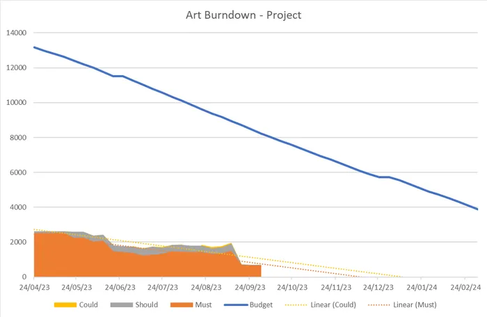
Musts: Work attached to a Milestone, or work that, if not done, you cannot ship.
-
Shoulds: If this isn’t done, the Customer will notice its absence.
-
Coulds: Its absence wouldn’t be noticed by the Customer, but they would be delighted by its inclusion.
-
Budget: The amount of time in hours remaining for any discipline.
-
Linear (Could): A trendline, if a project continues at this rate, the optional work will be done by X.
-
Linear (Must): A trendline, if a project continues at this rate, the mandatory work will be done by X.
Let’s use the Art team on Project A as an example:
..png?width=700&auto=webp&quality=80&disable=upscale)
The above graph shows that the team will smash its targets by the delivery date in 2024 – with the Musts ending before this year is out, and with ample time to work through the Shoulds and Coulds.
Burndown Charts can give us lots of insight into the project: we’re ahead of schedule, we’re on course to make the game with all the bells and whistles, we have maybe over-resourced the project and can reallocate people.
But the above graph represents a project in a very late stage of pre-production, and as it continues to evolve there’ll be lots of work that we simply can’t account for right now. It’s a great start that, whilst it doesn’t show us the full picture, implies that we don’t currently have to be worried about the way the project is going.
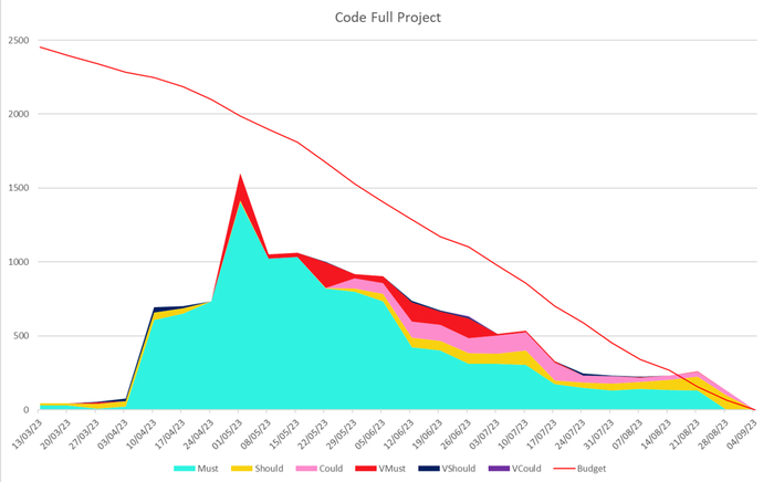
Another example below is the Code team on Project B with a slightly tweaked data set:

Here, we’ve added VMust, VShould and VCould – which are Verifies (Verifies: “complete” work that is yet to be tested).
Capturing this data gives us another useful point to monitor: how much risk is there that a large body of work that has already had significant resource investment is not fit-for-purpose? If, for example, you’re working on a porting project – which are usually primarily composed of Must tasks – any work that returns unexpectedly because it doesn’t quite fit the brief can significantly impact the ability to deliver on time and drastically affect our forecasting.
Verifies mean we can better understand the full timeframe needed to get Project B through the door, with as few nasty surprises as possible. We were able over time able to summarise from this chart that Project B would be able to deliver all of the Musts well ahead of the September delivery date, and it’s likely all the Shoulds and Coulds would be complete by then, too. We were also able to work out if we can divide our resources and identify the impact.
Burndown Charts are a highly effective way to get ahead of potential crunch within your team and enables you to keep your key stakeholders informed with targets. At the end of Project B, we were proud to have delivered a high-quality product to a happy bunch of stakeholders with a team that never had to crunch. Pretty neat, huh?
Development Effort Delivery Charts
Another key forecasting metric is Development Effort (Development Effort: the amount of trackable work hours that go into a project to move it forward) being generated by a team or an individual and Work About Work (Work About Work: things done in the day that are not directly completing tasks on a project), which includes things like annual leave, sick days, meetings, technical issues and so much more.
The percentage split between these two types of work is often referred to as Utilisation Rate and this number will be different at every single company. At Auroch, ours is 60/40 (Dev Effort/Work About Work) for Project Leads and 80/20 (Dev Effort/Work About Work) for other developers.
Taking into consideration our working week of 35 hours, we’re able to assume with reasonable accuracy that each developer on any project is able to deliver approximately 28 hours a week of Development Effort and spends the remaining seven on Work About Work. This is an incredibly powerful tool for forecasting to check in on our capacity in relation to the demands of the project.
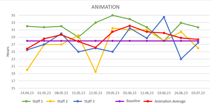
Here’s how this looks for our Animation team working on Project D:

Here:
-
Baseline: Refers to the hours of expected Development Effort each week.
-
Animation Average: The average output of the whole Animation team.
-
Staff 1/2/3: Members of the Animation team.
Charts like these enable us to identify where the team are at on any project, we can see here that Staff 1 (green) seems able to consistently deliver more than the 28 hours, Staff 3 (blue) fluctuates but is always on the average, and Staff 2 (yellow) experiences more extreme peaks and troughs.
Overall, they’re performing well and are on track to deliver what’s needed for the project. By looking at each individual person, we’re able to provide better 1/2/1 support for our people to determine why Staff 1 (green) is overachieving each week: are they at risk of burnout? Are they doing too much? Or understand the extremes of Staff 2 (yellow) to find ways to best support them: do they have dependants care on those days? Were they just having a rough week? These can be difficult questions for individuals to bring up with their line managers, so a production team being able to see these trends helps us be more supportive of our people.
Work Trackers and Work Type Charts
Most projects will have a mix of Project Leads and Developers doing different kinds of work. As mentioned above, the split between Development Effort and Work About Work for a Project Lead is more likely to sit around 60/40 and the work they’re doing is very different to that of a non-lead. They are also more likely to be doing lots of non-quantifiable tasks that are less predictable, cannot be tracked, and are more people-oriented – this is where Work Trackers come in.
Work Trackers are theoretically infinite buckets of time associated with a type of Development Effort work that has no definitive ending (like Verifies and Support), line management, or review. The Project Leads can use these ‘buckets’ to track time, for us to then export and analyse the data.
For example, here’s an Art Lead on Project E:
.png?width=700&auto=webp&quality=80&disable=upscale)
This person spends over half of their expected Development Hours every week on project tasks, 12% reviewing and 9% on management and support for the team.
Even though we never expect our team to work overtime (that’s why we have all of these tools in the first place!), we ask the team to share with us when they are in overtime territory so we can a) track it, b) find out why and put a stop to it, and c) determine the next course of action, like whether we need more resource, or to de-scope.
This is incredibly useful insight as a lot of Leads often find themselves in a position where they don’t have enough time to do ‘actual work’ (Tasks) which can result in a lot of overtime. With this kind of information, we’re able to ask whether we need more leadership capacity on a project to better support our developers working in that area.
Time Tracking
All of the above data is only possible through Time Tracking (Time Tracking: a system for teams to tell us what work they did in a day, and how long it took). Remember earlier when I said production needs to be transparent with development teams about how their data is used? This is why.
Not only do we want our Time Tracking to be honest, we also want it to be easy for our people to do. When onboarding people to a project, we share our Time Tracking process and walk developers through how long it will take, what they have to do, and how we’ll use that data to better support them.
——–
Unfortunately, there isn’t a single fix-all solution for Forecasting and it is instead a compromise of lots of tools to help build a better picture of the future, which improves over time with the more data you collect. If you’re looking to invigorate your Forecasting process, it’s worth bearing in mind three key things:
— You can’t always capture data in the exact way you want to… but that doesn’t mean you should give up – data is only one part of the solution. Even the smallest pool of data, combined with human understanding and context can prove incredibly useful for looking after your teams.
— Not all data is helpful data. You might have the ability to capture how many Tasks are remaining in a project, but is that useful? Is it going to give us actions that we can put into motion? And crucially, is it going to help the team and the project?
— No single data point will allow you to predict the future for certain, but the more data points you have and the more useful they are, the better chances of accuracy.
Helpful resources and links
• Auroch’s Production model is a purpose-built toolset that takes inspiration from many areas of project management, business analysis, and change theory, including The Agile Manifesto, Kanban, DSDM, Scrum, Prince2, DevOps, Lean, ITIL and more.
• Measure What Matters
• Superforecasting: The Art and Science of Prediction
• Uncharted: How to Map the Future Together.


