
Let’s talk about successful projects and, specially — their less successful features. When a game has been on the market a long time and has proven itself a source of high revenue, there might be this impression that all of the features developed for that project were, likewise, successful ones, right?
Undoubtedly, some of those features led to the overall success of the product. But the truth is this: every project has its own “graveyard of features” — a long list of useless, and sometimes downright “unsuccessful” features that were implemented in the project and in some cases, even managed to linger on. Usually, folks try to shuffle their “graveyards” safely under the rug, but today I’m inviting you to take a walk through ours.
Hi! My name is Boris Burangulov, and I work as a Producer on the War Robots project at MY.GAMES (Pixonic). For some context: our game is almost ten years old, has more than 250 million registered users, has earned more than 750 million in revenue — half of which has been earned in the last two years. The point is: we are a mature project, and we have continued to grow. So, we’re now at a very interesting point: all of the “obvious”, simple improvements have already been made, and now we’re forced to try increasingly risky and adventurous ideas. This means more experimentation and, of course, more mistakes on the way, expanding our “graveyard of features” in the process.
There exists a (fair) opinion that adapting ideas that someone else has already successfully implemented is a great strategy. If some other games have implemented a feature, it’s clear how it should work and how to use — so you just go for it! What could go wrong? However, experience has proven that something can, and does, go wrong.
Today, I’ve chosen some of the most remarkable “gravestones”, and I’ll share the story of a few features that we had 100% confidence in — but that just… didn’t work out as planned. This post is about mistakes that we’ve made — so you don’t have to!
This article is based on my panel talk at Nordic Game 2023.
Chain of offers
The first feature in our “graveyard” is a chain of offers. It’s possible you’ve encountered monetization mechanics like this in some game: a player is invited to purchase an offer, which leads to the purchase of another more profitable one, then next one and so on – up to the “juiciest”, final offer.
In general, it’s clear how these mechanics should work: if the player buys the first offer, they obviously aren’t supposed to stop at that one, they would naturally want to continue – after all, all subsequent offers are more profitable. In a nutshell, their desire to get closure pushes them to get to the end of the chain. We considered chains to be a worthy addition to our roster of monetization mechanics, so we implemented it and happily began A/B testing.
Case one: basic approach
First, of course, we tried “classic” chains, where the first offer is cheaper (to engage the player), with further cost increases and benefits with each subsequent offer in the chain. In the control group, players saw one offer with the same number of resources for a price equal to the total price of the chain. And the first results were quite encouraging – the revenue from the chain offers was significantly higher than the control group!
However, when we dug deeper, our excitement died away. The chain was working, but not because the players were buying more. Players bought the very first offer (which was cheaper) and a few players bought the second one, but the third offer (that is, purchasing the entire chain) was only taken by a smaller (or the same) number of players (depending on the player category) as the control group.
In other words, the expected “engagement” did not actually occur, and the same result could have been achieved without implementing the chain mechanics, and instead, simply by making two offers – a cheaper one and a more expensive one.
Case 2: checking the “mechanics”
To further confirm our hypotheses, we continued experimenting with different chain variations; one of these is “free” offers. In the chain, the first offer needed to be purchased, and the next two could be picked up for free. The control group had the same content and the same price. And here we didn’t see any difference between the purchases.
And this was despite the fact that the chain was presented as a separate section, with a separate notification, and the offer in the control group was just one among many others (that is, it was in a disadvantageous situation from the beginning).

Case 3: many other tests
Since testing these mechanics was quick and cheap, our monetization department tried different variations. First, we changed the content. Spoiler: the results didn’t depend on the type of content. Second, we tried offering chains as starter packs for new players. Spoiler: we didn’t see a significant difference in the overall conversions, but the new players’ conversion to the chain was even lower than to a similar offer.
The best results were with experiments where we tried to use chains as advertising placement. In our game, with some of the offers, there’s a bonus that can be obtained from watching video ads, and actually, chains turned out to be more effective as advertising placement than regular offers for ads – this is how we use them now.
Conclusion: no matter how we sliced it, we didn’t manage to successfully incorporate offer chains; the only benefits were from ad placement.
Battle Pass(es)
A few years ago, like many other projects, we introduced a battle pass (BP) into our game; it’s a popular, understandable mechanic for players. In our game, this was called “Operations”, and it occupied its niche among our other monetization mechanics (and this niche was neither small, nor big). But one day, it dawned on us – what could be better than one battle pass? Obviously, multiple BPs! The more the merrier, right? So, our second story is about battle passes. Yes, plural. But sometimes, more doesn’t mean better.
We had modified our Operations, and instead of one line with rewards, we implemented four lines at the same time. Progress was achieved according to the same principle – for battles – but in the different lines, a different amount of experience was required to get to the next level. Also, the lines differed in their content: some had more content (robots and guns), some had more resources.
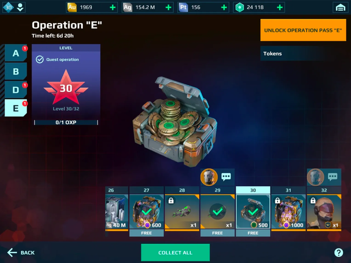
In addition to the obvious “more is better” approach, different lines of BP were supposed to be appealing for different players, and this was intended to expand the audience of this feature. Also, the lines began and ended at different times, which should have reduced the seasonal nature of the rewards. Well, indeed some reduction occurred – the reduction of our revenue!
The overall revenue from this feature decreased right from the moment the feature was introduced. After the first months of operating the feature, we compared the monthly revenue over time (it was complicated to introduce this feature with an AB test) and immediately found out that after introducing it, the decrease of revenue almost amounted to 10%.
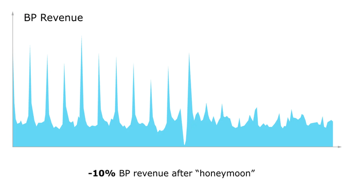
Naturally, we tried different options for launching battle passes and tested different approaches, like launching a special BP for beginners. But this didn’t bring any radical changes, and later on, the BP began to be cannibalized by other, more effective monetization mechanics. Thus, we completely lost interest in this feature, keeping it around just to check off a box.
Why did it go this way? Our hypothesis is that additional battle pass lines over complicated the feature, it became less convenient to track your progress, and, in the end, players tended to buy only the most interesting battle pass, the one that rewarded resources.
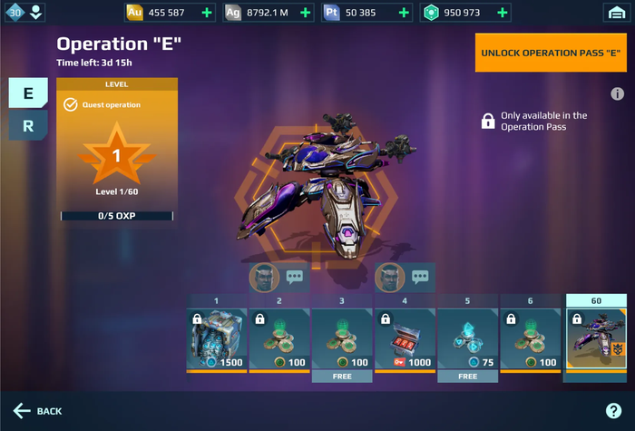
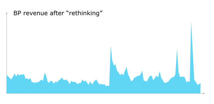
Indirectly, this hypothesis was confirmed during our recent attempt to bring the battle pass to life. We recalibrated the number of BP lines from 4 to 2, and made a clear division of the lines (one was dedicated to the current event and event chests, the second was a way to get resources daily, and the content of these lines didn’t overlap), we added extra motivation to track progress (all free content that players could get in the event was moved to the free BP line). As a result, we got a good revenue boost, but we don’t know if the classic BP would have performed worse.
Fun fact: once, during conversations with a business partner, we received very positive feedback on this particular feature; we were complimented for our original idea and flexible approach to the players. But, we didn’t dare mention this feature had already been relegated to our graveyard of ideas; it was still in the project just because it was more expensive to rework it than keep it as it is.
Fixing the starter kit
Next in line is another brief and sad lesson – especially for perfectionists. This is the story of how we suddenly discovered that “right” doesn’t always mean “useful”.
In our game, players go into their very first battle with one starting robot (Destrier), with two installed guns by default. And this is something that has annoyed generations of game designers for years – these are two different guns. They have different appearance, mechanics, they’re effective at different distances… in general, they look completely inconvenient (moreover, the analytics show that when players assemble the builds themselves, they tend to use either the same or similar guns).
And then, in a beautiful twist of fate, the game designers convinced me to give the go-ahead to “fix” this. (With the help of AB testing, of course.) The first test group was given two different guns effective at the same distance, and the second – the more convenient loadout of two identical and most effective guns.
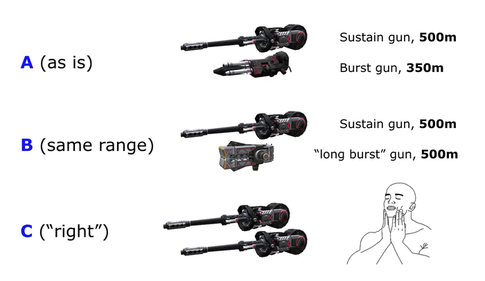
Imagine our disappointment when the first group didn’t show any significant improvements! Meanwhile, the second, “convenient” group, yeah, it showed an improvement in retention and a significant decrease in conversion to paid users! To the great sadness of the game design department, we had to keep the “inconvenient” starting guns.
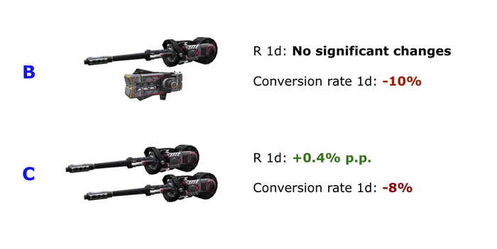
The bottom line of this story: it’s important to test even those things which everyone believes to be right, useful, and obvious.
Downloading the tutorial
Let’s move on to our final story (and the biggest feature) in our graveyard: the tutorial download. This is the endgame of our longstanding struggle to optimize the game start funnel, and in order to present the full context, we will have to start with a historical digression.
In 2020, the size of our game was close to the psychological border of 1GB. At this point, the entire game build could be downloaded from the store. Yes, the download might have taken some time, but the player could immediately start playing after that. This situation was complicated by the fact that, at that time, we were finishing a large-scale graphics remaster of the entire game, and the volume of assets should have grown even more (more than twice for the heaviest graphics preset). The very first launch of the remastered version brought a very serious problem to light: an increase in the build size led to a drop in conversions from store to install.
Therefore, our first stage of optimization was the creation of a content delivery system. Instead of one large build, the player downloaded a small application in the store, but on the first launch, the application was “blocked” and finished downloading the missing assets; only after this could the player start playing.
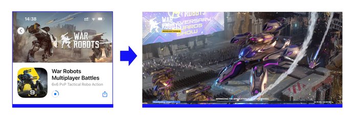
The results were pretty interesting: in a nutshell, conversion in the store grew tremendously (more players downloaded the app), but the percentage of players who made it from installation to the first battle fell enormously (not everyone waited for the remaining files to be downloaded). Bottom line: more players were downloading the app, and this provided a convenient tool for emergency fixes, so we decided to keep the feature. So, we decided to keep this feature.
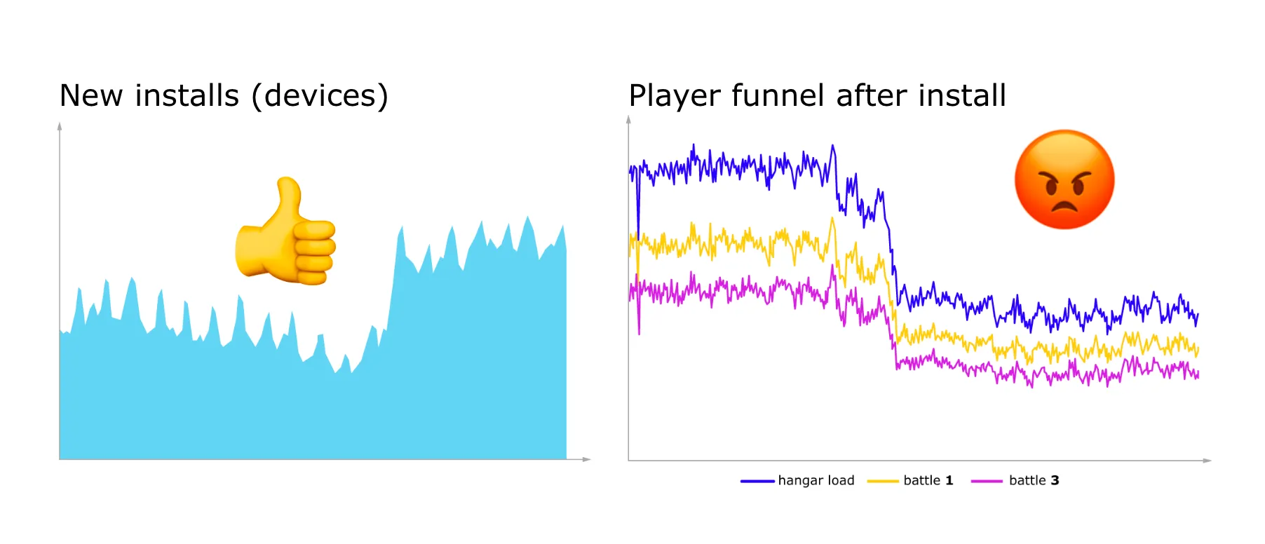
And this is where our story begins: we had started thinking about ways to reduce the churn among players who had already installed the game. The solution seemed quite obvious – and you can see it in many modern games – downloading a tutorial. It’s logical that the churn happens because few people like to just sit and wait until the necessary files are downloaded. On the flip side, players churn less when they can immediately go into battle. So, we should let users play while they download the game!
But this was not an easy task from a technical point of view, especially for such a mature project as ours. In addition to implementing the ability to go to the starting battles while downloading bundles in parallel, we also had to make sure that performance was stable. But everything worked out and we finally obtained our first results.
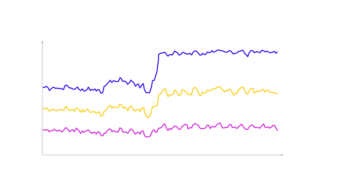
Nice graph, isn’t it? Even though there are no captions, it’s always nice to see something growing! And on the graph, you can see the percentage of players going from the install into battle during the first hour. Immediately after this feature launched, churn greatly decreased. It would have seemed that a celebration was in order! But we were still on the watch. All these changes were not done in dynamics, but as an AB test – and we compared the old and new ways of downloading.
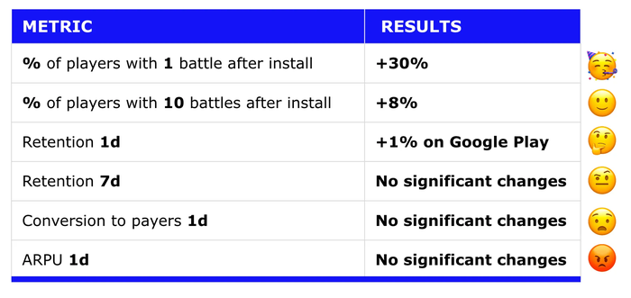
And here are the results of the test: yes, the improvement in the funnel is very noticeable – 30% more players go into the first battle than in the control group. However, by the 10th battle, this difference is greatly reduced. But the most bitter pill to swallow was that the product metrics for which all this was started showed a surprising indifference to our efforts. So, for example, the retention of the first day differs very slightly in the test group, the conversions of the first days are not significant at all.
It turns out that, despite the fact that with the follow-up content being downloaded during the tutorial, significantly more players start the game and even go through the first battles, and ultimately, not that many players remain (and pay) in the game. In our case, with large purchase volumes, of course, every fraction of a percent gives its own positive result, but this is not at all what you expect from such a feature (it’s rather expensive to develop). So, despite the seemingly obvious usefulness of such a feature, it’s far from certain that the result will pay off all the costs of its development.
The bottom line: if you’re thinking about whether your project should have a modern and trendy tutorial download – think harder (especially if you do not have a lot of resources). Perhaps you can invest them in other features that are more valuable for your project.
Resting in peace
In any project, one of the most difficult tasks is to determine which of the ideas will go further into development and how to prioritize them (after all, there are always more ideas than resources). And in the prioritization process, one of the arguments “for” a feature may be the fact that large and successful projects have that feature, too.
However, as you’ve seen, the “graveyard of features” that every project has is not so obvious from the outside looking in. Further, even the most obvious and useful things, features that everyone has, may not be that great for your project (and you can waste your resources chasing them), or even actively do harm.
Therefore, my advice is this: even when you’re absolutely certain about the outcome, do not neglect testing your ideas and making an MVP in order to slam the brakes if the result will not be satisfactory. In particular, if you’re thinking about implementing one of the features we’ve covered today… maybe you should think twice!


