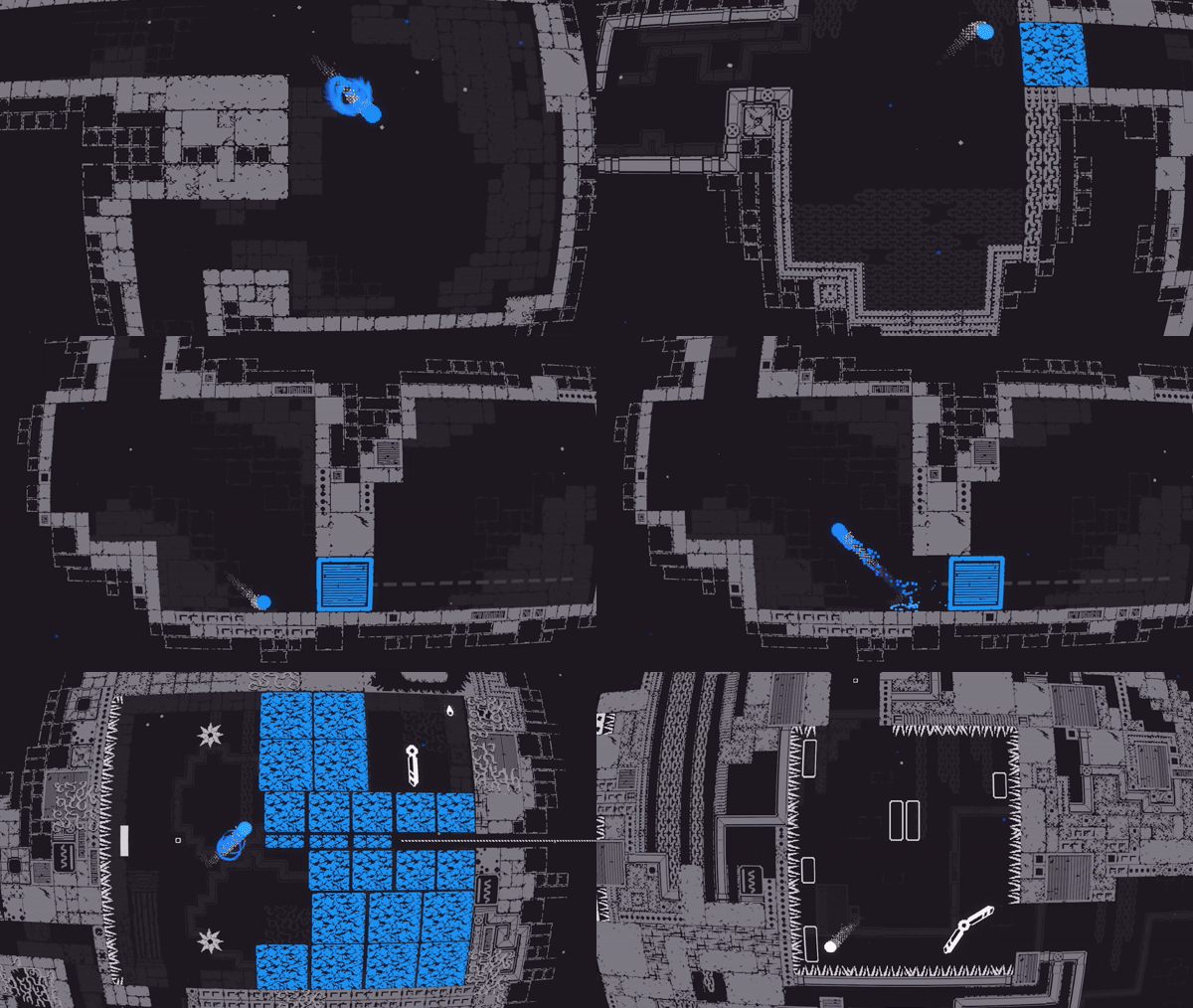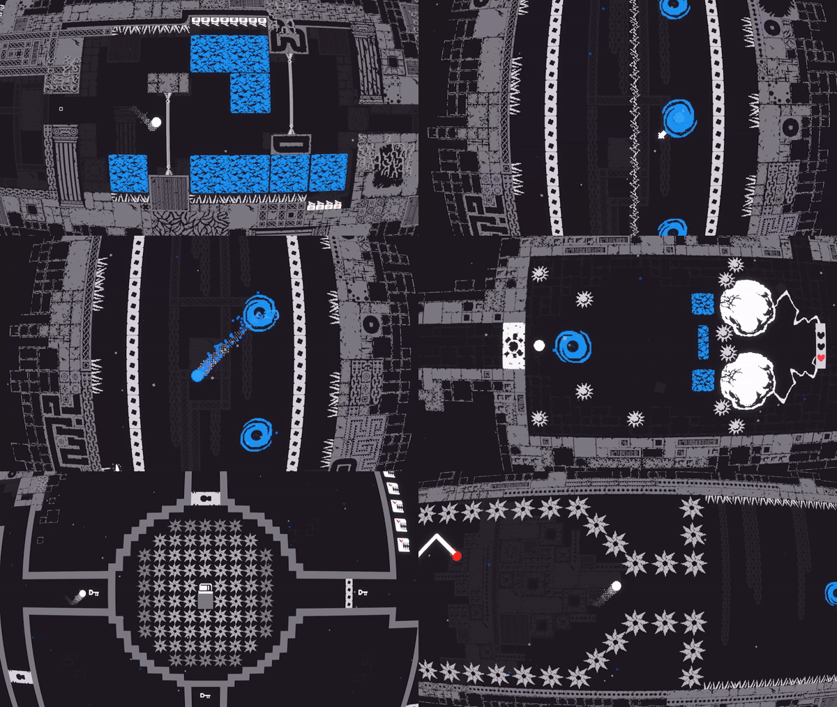
Hello, we are Brad Austrin, lead designer, and Matt Raithel, executive producer, of Graphite Lab, the makers behind the newly-released qomp2. We partnered with Atari to make a sequel to 2021’s qomp, which itself was a creative spiritual sequel to one of the most iconic games of all time – Pong.
For qomp2, our main vision was expanding the narrative of the original qomp. A lot of the worldbuilding we did played off ideas first presented in the original game. It portrayed a very minimalist, monochrome world where danger lurked just outside the bounds of what one would see on a Pong game screen. With qomp2, we also begin the game with that same setup, though the ball controlled by the player this time is different from the one in the first game. It’s not a simple re-tread, but a means to show that in this world, there are multiple “balls” feeling trapped in situations where they can only get hit back and forth for eternity. This concept of feeling trapped and thinking you’re suffering alone is something that is gradually explored in qomp2 over time.
As a duo, we were responsible for the game’s initial pitch and game design document, and making sure the rest of the team had support for things they wanted to try with the game. Concepts like the new circular ball design, the “dash” function, and the addition of a blue color painted throughout the world for emphasis are all ideas that existed from the first pitch that made it into the final game. We would occasionally receive feedback from Atari on elements that weren’t quite working, but if there was something we felt strongly about, we’d communicate that to them and collaborate to make what was best for the game. Atari was a really supportive partner on this project and gave strong creative freedom to our whole dev team! There was an amazing foundation in place from qomp, but also lots of room to expand on ideas. The ideas the team had were great and the support from Atari was amazing from the get-go.
When it comes to narrative design, one of the most important things we’ve learned when working on licensed games or games with strong established brands is that you need to get in the head of the thing’s creators, then tap into what people find special about what they made. We spend lots of time at the beginning of a new project learning to speak their language, so to speak. It’s almost to the point where it feels like we’re putting on a costume and pretending to be them!
This is something we did with qomp as well. We played the original game, of course, but also did research on the original creator, Stuffed Wombat. We watched their presentations, looked at their social feeds, played some of their older games, took in content from the original qomp that was cut in the final game, and so on. We worked to think like they would as we designed this game. That isn’t to say that you want to become them too strongly, you know? It’s important that a sequel doesn’t feel like a formulaic copy of an original, and it’s important for the new team to allow their own personal touches to shine, as well. For example, one thing we’re passionate about in the games we make is doing our best to make sure as many playable aspects of a game contribute to the story we’re trying to tell. The interactivity and things that the player can do should harmonize with the story as much as visuals, sound, and music would. We’re happy to say that this is also the case with qomp2, where everything the player does and all the things they tango with are fair game when it comes to interpreting this one’s overall message.

As we sat down to make a new qomp, our plan was never to continue the story where qomp ended, as it had a very satisfactory conclusion. Instead, we wanted to build off of a potential interpretation of the game’s ending. When you finally reach freedom in qomp, the ball automatically moves in a circle, a departure from it moving forward in a 45-degree direction. The circle has to be drawn for seven uninterrupted seconds in order to clear the game. The ending is up for interpretation, of course. The circle you draw could mean it achieved wholeness, or maybe the circle means it’s trapped in a new endless, timeless cycle. As we thought about that second interpretation, we decided to explore that concept for the new game. What if a ball that was trapped in a timeless cycle of Pong eventually manifested into a circular mutation, a physical representation of a possible interpretation of the original?
So, that became the starting point for the new circle shape, which is key to this game’s story and overall theme of identity. Without giving too much away and in the spirit of minimalism, we can’t share too much about what it all means. But we’ll share some questions that might help you understand some of our narrative goals. In a world of pixels and blocks, a circle is unusual, isn’t it? Being one amidst all that might feel alienating, right? When one is faced with a change within oneself, sometimes, all one can do is cry, no? And lastly, when you think of a ball in the real world, you naturally think about the shape of a circle, don’t you?
We hope that you’ll think about some of these ideas as you play the game and see what conclusion you might be able to draw about what it means to you!
Visually, we put a great deal of effort into utilizing shapes to support the game’s themes. As you play the game, you’ll notice circles and squares in not just the environment, but in obstacles, foes, and other miscellaneous support objects along your journey! We also utilize the color blue a lot in the environment, as mentioned before. The blue serves a greater narrative purpose but also helps the play make the connection between when a dash is needed in a level.
When we first made the design document for the game, we supplied some basic images for what we had imagined would do so in a satisfying way, and when it came time to make the proper assets, the art team had creative freedom to do their own thing, with our reference serving as a starting point. There were times when an artist would come up with an even better representation of an idea we were looking for, and there were other times when we’d have to reject something if it didn’t quite fit the vision.
Of course, we also made sure that all the art we made felt like the original qomp. qomp2 features some assets from the first one, like spikes or some of the environment tiles. In places where we needed to make new art, we made sure that they felt in line with what the talented artists behind qomp had made!

We explored some other art styles for the game in our earliest milestones. Around the prototype we had a pretty nice visual style going, but lost some continuity between the two games. It took some refactoring to adapt the classic look, but the two games play more seamlessly with that decision made.
As a spiritual successor to both Pong and qomp, we would like for people to see qomp2 as its own standalone story. There’s some loose connection to the original qomp or Pong, but there isn’t some grand multiverse or Marvel-esque story at play here. This is strictly the story of qomp2’s ball and it starts and ends with this title. It is our hope that this journey adds a little something to the player’s life in the real world, even if it’s a small thing!
As a sequel, the original qomp was always on our minds as we designed every aspect of qomp2. There’s really no need to enter with any kinds of expectations or experience playing either. Anyone can pick up this game and learn it very quickly, even if it’s their first game. Those who are familiar might understand how the ball rebounds off of walls quicker since that behavior is based on older Atari titles, but we begin the game without dangerous obstacles in order to make sure every player can understand it before they reach something that could threaten them.
Going from qomp into the sequel will feel really natural. If you are like us, playing them in reverse will really make you miss the dash mechanic! We hope that fans really love the effort put into qomp2 and count it among their favorites!


