Game Developer Deep Dives are an ongoing series with the goal of shedding light on specific design, art, or technical features within a video game in order to show how seemingly simple, fundamental design decisions aren’t really that simple at all.
Game Developer Deep Dives are an ongoing series with the goal of shedding light on specific design, art, or technical features within a video game in order to show how seemingly simple, fundamental design decisions aren’t really that simple at all.
Earlier installments cover topics such as how Mimimi games crafted the save scum-friendly save system in Shadow Gambit: The Cursed Crew, and the technical work and creative nuances behind Slime Rancher 2‘s new weather system and the experiential impact that developers Monomi Park designed for players, and the marketing strategy that helped Timberborn‘s popularity soar with only two years in early access with Mechanistry comms manager Michal Amielanczyk.
In this edition, lead game designer May Wong and narrative designer Aoife Gleeson from INTERIOR/NIGHT give detailed insight into the accessibility improvements made with the PlayStation port of As Dusk Falls.
We are May Wong, lead game designer, and Aoife Gleeson, narrative designer, from INTERIOR/NIGHT, the studio behind the award-winning crime drama As Dusk Falls. Today, we’re going to discuss some accessibility improvements we made while porting As Dusk Falls to new platforms, specifically focusing on features for blind and low-sighted players.
Reception of the original release
Making the game accessible and approachable for all types of players, including disabled players and non-gamers, was a core pillar during development. When the game was originally released in Summer 2022 on Xbox and Steam platforms, we were very pleased with the positive response our accessibility features garnered, including an ‘Accessibility Innovation of the Year’ award from MCV/DEVELOP and a nomination for ‘Innovation in Accessibility’ from the Game Awards, alongside titans like God of War: Ragnarök and The Last of Us Part I remake. The original release included features like:
-
Customizable QTE types, e.g., Replacing button mashing with a single tap.
-
Complete button remapping.
-
Screen reader functionality, which made the game fully playable for blind players.
-
A mobile Companion App that serves as a game controller and allows you to play As Dusk Falls from a mobile device.
-
Editable Choice and QTE timers.
-
Font customization including subtitles, closed captions and choice text sizing, plus customizable font colors for better readability.
However, there were a few key improvements we wanted to make after receiving feedback from both players and reviewers. Porting the game to PlayStation and other platforms provided the perfect opportunity to do this.
Making quality-of-life improvements to the screen reader
The single largest feature addition we made was Audio Description, which we’ll get to later in the article. First, we made a number of quality-of-life improvements for screen reader users in collaboration with our dedicated code team. These included:
-
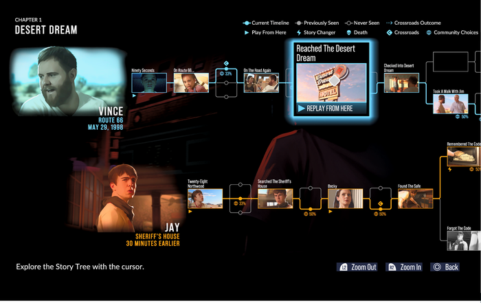
Story Tree Improvements: The Story Tree menu is a branching nodal map that shows players key decisions they’ve made in the game on current and previous playthroughs. This screen lacked coherent navigation description as it was unique from other menus. We retrofitted unique navigation descriptions and ensured no information was being lost in the description (e.g. identifiers like ‘Crossroads choice’ and ‘Character death’). Since the story tree was primarily built for mouse or free joystick interaction, it proved to be one of the more difficult menus to make accessible. This is a good lesson for any ‘map’ or ‘tree’ interactive elements: if possible, consider at an early stage how they might be used by non-sighted players.

The in-game story tree. Images via INTERIOR/NIGHT.
-
Speed Customization: We added speed adjustment, which was a highly requested feature. This was presented as a slider option in the accessibility menu. We determined upper and lower speeds (plus interval bands) through best practices research, speaking with consultants, and trial and error.
-
Broadcast Mode Improvements: Broadcast Mode is our Twitch mode where a streamer’s viewers can cast votes on choices by inputting a choice code into the chat. This code was not being described for non-sighted players, so we went back and fixed it.

Image via RossMinor’s Twitch stream.
-
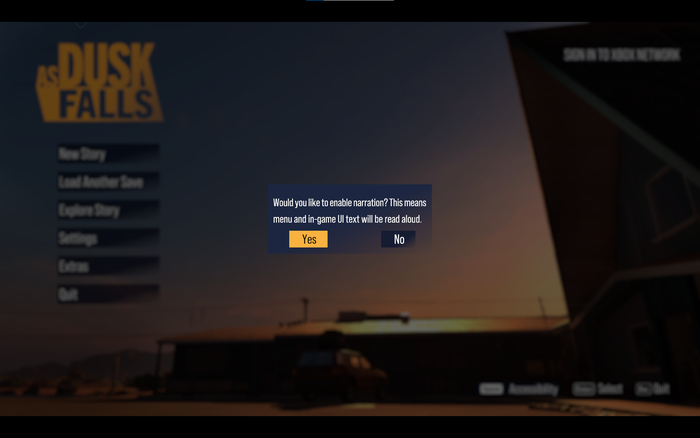
Start Up Flow Refinement: In the original release, waiting for 30 seconds on the start menu caused the screen reader to kick in, prompting the player to ‘Press [button] to Start’ (button being dependent on the platform). This, however, did not enable the screen reader permanently. Players found it difficult to then navigate to the accessibility menu in order to enable the screen reader. To provide a smoother start up experience, if the player waits that initial 30 seconds for a spoken start up prompt, the next screen is a narrated pop-up offering to enable the screen reader. We give this as an option, rather than just enabling it, because players who don’t need the screen reader may also linger on the start up menu for a variety of reasons.

The main menu pop-up that players receive after waiting for the start up screen prompt. Image via INTERIOR/NIGHT.
We also explored making the Companion App more accessible for blind and low-sighted players, but unfortunately, during the time we were working on the port, this functionality was not yet available through Unity.
Bringing experts into the process
While we were pleased that the original release was fully playable for blind and low-sighted players, we were aware that there were key beats and nuances in the story that were conveyed through silent action. A consistent note of feedback we received was that Audio Description would significantly improve the experience for these players. While this was no small undertaking, improving the story experience for this subset of players was very important to us, since the story is the heart of As Dusk Falls.
Vital in this process was the input and advice of consultants. After writing portions of Audio Description, we engaged with Brandon Cole and Ross Minor, accessibility consultants whose advice and feedback proved to be invaluable. We also worked with Descriptive Video Works, Jenna ‘Jennisary’ in particular, who provided excellent training and script audit services. If we can impart you with one takeaway from this article, it’s to enlist advocates, consultants and disabled developers early in your accessibility pipeline. It will massively improve the game’s quality. While we started out viewing Audio Description from a largely functional perspective, the input from our consultants really highlighted how it’s an artful form of storytelling to be treated with care.
The details you highlight when describing a scene create a sense of place and tone, the relative length and frequency of your sentences can help or hinder pacing, your descriptions of subtle facial expressions can enrich the story experience, etc. Compare “He enters a dive bar awash in purple and red light” to the plainer “He enters a bar” (or compare “Vince’s face slackens” to the more prescriptive “Vince looks forlorn”), and you’ll start to get the picture. Add to this the constraints of available space forcing you to be concise, and you have a challenging and rewarding form of writing.
Designing and implementing audio description
In terms of the practicality of introducing Audio Description, one of the most difficult early decisions we had to make was opting to use a synthetic voice rather than a voice actor. The latter would have been obviously more immersive, but timelines and budget considerations meant that we were not able to opt for it this time.
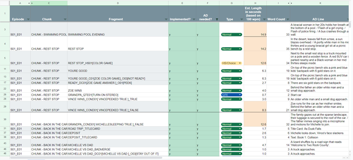
While using a robotic voice certainly has its drawbacks, it provides interesting versatility. Screen readers do not all use the same voice packets and can vary in speed, so we designed for a rough average when starting out. Using 180 words per minute as a rule of thumb and using an Excel mastersheet of all ‘fragments’ (scenes) in the game, we were able to estimate how long any written clip would take. Punctuation also had to be accounted for, with full stops in the written script causing lengthy pauses in the description. We attempted to write around this, balancing pacing with the need to convey vital information.
In terms of implementation, As Dusk Falls was built in Unity with Timelines being used to assemble the content of fragments. To later implement Audio Description for the port, we wrote the scripts in Excel and pasted the strings into custom Timeline clips with support from Game Designer Marta Durand. Here’s where our theories of speed met practice: implementing clips regularly involved rewriting them for a better pacing fit. As with any quality writing process, it required iteration, particularly after script audits with Descriptive Video Works and feedback from consultants.

The mastersheet we used to assess, write and track implementation progress on Audio Description. Image via INTERIOR/NIGHT.
We also had to account for branching, ensuring that any path through given scenes would flow naturally. For example, in Audio Description, when an object is introduced for the first time, it should be described as “an [object]” and subsequently referred to as “the [object]”. This is because it’s the first time it’s being mentioned in the context of Audio Description. For sequences that branched, we needed to identify the first instances of relevant items (e.g. a gun, a door, a notebook) and ensure consistent descriptions thereafter. This also applied to the introduction of characters, some of whom could make their first appearance at different points based on player choice. We had no dependency system for this, so we had to do it the old-fashioned way.
Since players could adjust the speed of their screen readers, this meant we had to be careful with clip placement. If we described too much in one clip, a player using a high-speed setting (which is quite common amongst screen reader users, some of whom use dizzying speeds) would receive the information too quickly, “spoiling” the incoming action or rendering it confusing. This necessitated a fine balance of placing clips close enough to their relevant action without risking overlap with dialogue or loud sound effects. This generally applied to action scenes, as we aimed to maintain the tension of the story. With quieter scenes or scenes introducing a new environment, we could be more lenient.
Finally, we implemented better descriptions for QTEs. In the original release, the QTE description would instruct you on what input action to perform (e.g., Swipe, mash, etc.) but not what the in-game context of that action actually was. We inserted short, action-based descriptions (e.g. Kick desk, Grab shotgun, Run to truck) to provide a more immersive experience without ruining the flow of a QTE. Since listening to a full description on the slowest speed setting could make a player likely to fail a QTE, we prompt them with the option to extend their QTE timer when enabling Audio Description in the main menu. We also explain why we’re offering this option so that the player can make an informed decision on their gameplay experience.
The challenges of retrofitting
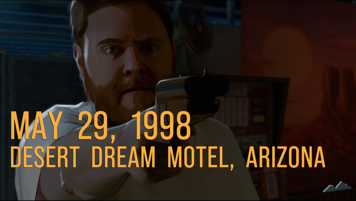
One of the biggest challenges with Audio Description, and sometimes with the screen reader in general, was retrofitting description into scenes that were not designed for it. As Dusk Falls features a large amount of dialogue, making it challenging to insert things like character introductions in scenes where there’s little to no quiet space. We could alleviate this through iteration and refinement of descriptions, but sometimes, there was nothing we could do.
This was also a challenge with certain UI elements. We have beautiful, cinematic title cards throughout the game that orient the player in the story. Some contain the year (which can take the screen reader quite a while to say) after which certain scenes move straight into dialogue. We had the same issue with scenes that contained device text (SMS messages and pagers messages) displayed on screen. The solution to this was the same as above: continuous iteration and testing.
Another drawback from a player’s perspective was that it could sometimes be difficult to aurally distinguish between on-screen text and audio description since they were using the same robotic voice. A great suggestion from one of our consultants, which we were unfortunately unable to include because of resource constraints, was to allow users to select different voice packets for audio description versus general gameplay/UI description. This suggestion might be useful for other teams and projects.

Conveying action occurring between dense UI elements and dialogue proved challenging. Image via INTERIOR/NIGHT.
Another UI tripping block was the Outcome icon, which pops up throughout the game and indicates to the player that they’re seeing a consequence of a choice. These could interrupt descriptions and were intrusive to our implementation workflow. Our code team found ways around these interruption issues, implementing a flag system that allowed them to assign priority to different UI and description elements, ensuring none were interrupting each other.
Lastly, we had some issues with audio balancing. At the time of the original release, players pointed out that gameplay description was difficult to hear during loud action scenes. While PlayStation ducks the audio when the screen reader is speaking, this didn’t apply to all platforms. Building a custom audio ducking system was not feasible for porting, so we instead implemented a pop-up that recommends an optimal SFX & Music level to the player after they’ve enabled Audio Description. If the pop-up is accepted, those values change accordingly. It’s an imperfect solution but one we’ve received positive feedback on, since it alleviates players needing to interrupt a play session to continuously tweak audio values in search of an ideal mix.
Conclusion
Challenges aside, making these improvements proved absolutely worth it. We were delighted to see both new and revisiting players engage with and celebrate these new features. Porting enabled us to bring the game to a wider audience, and our accessibility improvements widened that net even further. We’re pleased to have been able to provide what reviewer SightlessKombat dubbed the “definitive version” of As Dusk Falls and that we were able to add features that “ensure as many people as possible will get to experience this dark and gripping narrative adventure”, a quote from blind journalist Victor Dima. It’s been a very joyful experience for the game to be appreciated by a player base that is too often ignored or under-considered.
As a final note of advice: the earlier you build accessibility considerations into your pipeline, the better. This does not preclude you from introducing features and improvements later, as we have, but having a broader eye on your player base will create a stronger foundation from which to build a truly accessible game.


