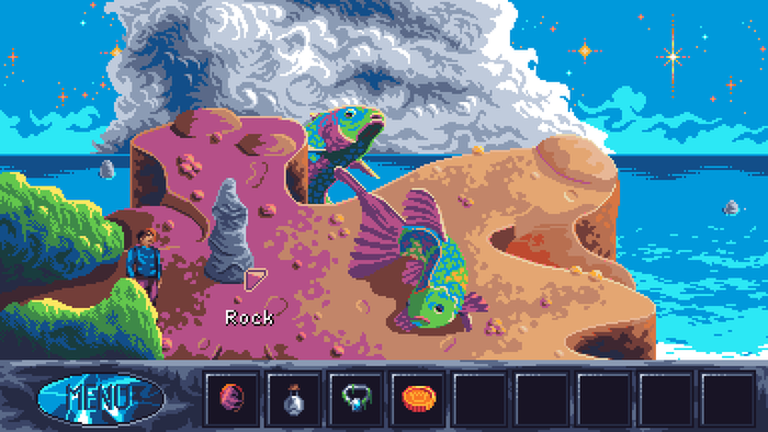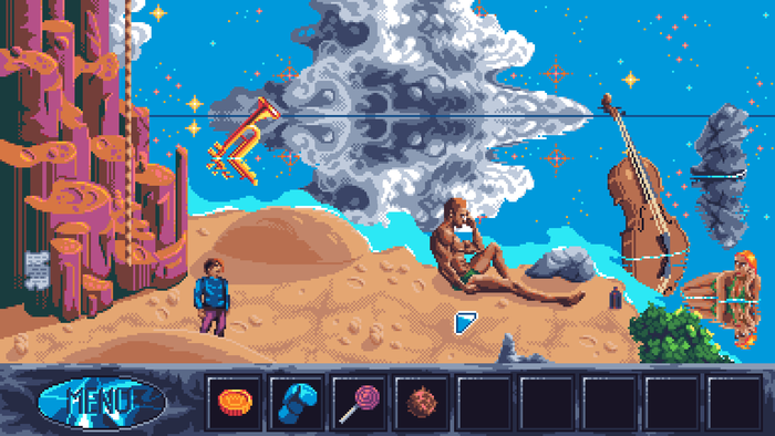
Twilight Oracle is an indie point and click adventure game that takes the impeccable vibes (and main gameplay verbs) of a 90s LucasArts adventure game with a wild, appealing art style: think giant rainbow fish bouncing on the top of a cliff, underwater fantasias and intergalactic vistas worthy of the finest vaporwave compositions.
The game comes from developer Cosmic Void, a one-person studio whose founder goes by a pseudonym of the same name. They told us that to make Twilight Oracle, they had to grapple with key aesthetic compromises to preserve a positive player experience—but found joy in the craft of pixel art and using it in the name of visual-first storytelling.
Twilight Oracle’s aesthetics are otherworldly but understandable
First off, I’d love to hear how you do visual development. The art style of the game is so fun: a sort of day-glow (at least in the areas I’ve played) pixel art that suits the surreal story here. How do you establish style and visual language as you work on the game?
Thanks! Generally speaking, I think of places that would be fun and exciting to explore, so in Twilight Oracle that meant the shore, the underwater location with a huge machine, etc. The stylistic goal is to keep the visuals clear and easy to read, which at times may come at the expense of details. The colors need to pop, be vibrant, which gives it that ‘fun’ and cartoony aspect, but that also means that if you’re working with a rather limited palette like I do (32 colors in Twilight Oracle), ashen tones are partly sacrificed, which sometimes you really need to create depth.

Specifically, where did the giant fish characters come from? They are… really something! Do you write characters/story first and suit the art to the story, or perhaps the other way around?
So my approach is all about visuals first, storytelling second. I kick things off by sketching out a bunch of cool locations that I think would be cool to explore, then tailor a narrative around them and come up with puzzles. When it came to the fish, I wanted something quirky—and I thought, well, if I place them not in the water but on top of a cliff, that would add a fantastical angle. I also wanted them to be really big for an artistic reason—that allowed me to cram in more details. Once I had both fish in place, I sat down and wrote the banter between them, and of course it had to be very silly, I mean, they’re two massive fish hanging out on top of a cliff!
As a pixel art lover, I’d love to hear your thoughts on working in this style. Do you prefer it to other digital art styles? Do you feel it especially complements the genre?
I’m a big fan of pixel art since I grew up playing games made in that style. When I dove into game-making in 2020, it was a no-brainer for me—pixel art all the way. I wanted to recreate the vibe of games I loved like Space Quest II, Simon the Sorcerer, Kyrandia, King’s Quest IV, and others. Pixel art just feels nostalgic, fun, and cartoonish, making it the perfect fit for the kind of games I want to create.

Generally, I’d love to hear your take on creating coherent puzzles and storytelling in such a fantastical setting. Is it hard to direct players/leave visual cues when things are so wild (appreciating, of course, that the adventure genre has traditionally had a pretty cartoonish sense of logic/reality!)
Is it hard to keep the rules “straight,” on the dev side? Any tricks you like to employ for crafting an easily parse-able experience for your players? Does this come from experience (having made several point and click adventure games, etc.)
I think puzzles must make sense, even if it’s cartoon logic, and the game must offer some signposting with regards to the solution. ‘The bridge is RICKETY. You’ll need to find something to FIX it with. Perhaps you’ve seen something nearby that can help with that?’
Cartoon logic can totally work unless you’re going for an hyper realistic style. So long as the general logic and solution are in some form hinted at, that’s all good.
Signposting is even more vital when you’re going for puzzles that require lateral thinking and a creative use of items, and lateral puzzles are my favorite kind of puzzles. If you can creatively use an item to overcome an obstacle, that can be a lot of fun. Of course, it’s important to also pepper the game with easier puzzles, they can’t all be tricky.
Typically, I like to break my games down to areas/parts. That way, if you limit to only a few screens the world the player can explore at any one time, you reduce the amount of backtracking, which can be frustrating, and it also makes the puzzles more manageable.
That also helps shape up the narrative and keep it structure, as it forces you, the developer, to have a local goal (what you need to do to finish this part of the game) to complement the global goal (what you need to do to beat the game).
And it’s important to set these goals and communicate them to the player, otherwise they may find themselves aimlessly wandering about.


