
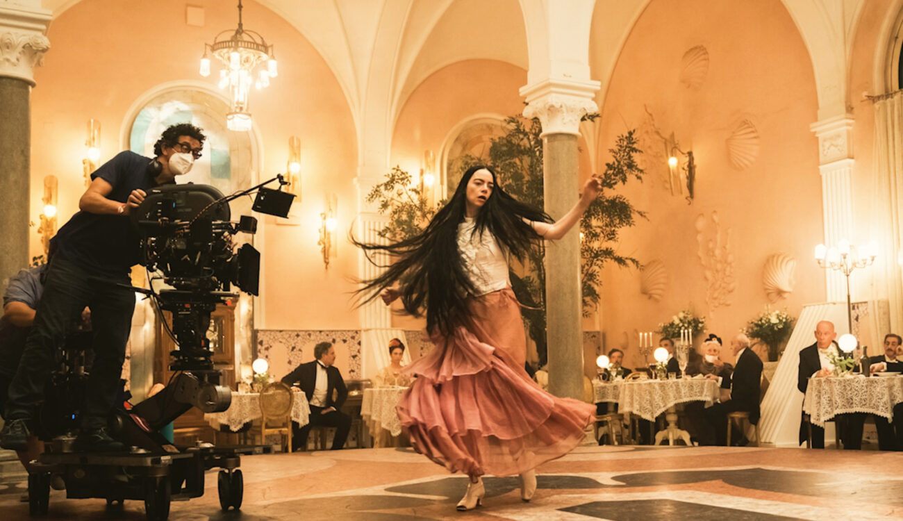
“I’m a flawed, experimenting person”, says Bella Baxter, the main character of “Poor Things”. I can’t help but wonder whether this description also perfectly matches director Yorgos Lanthimos and, in fact, the whole cast and crew of this bizarre and wonderful film. After watching it, my first question was: How on Earth do you create such an imaginative, playful world, chaotic and concise at the same time? In the ASC clubhouse conversation, cinematographer Robbie Ryan takes us behind the scenes of “Poor Things”, shares insights into this collaboration, and talks about the cinematographic rules they had (or maybe lack thereof).
Of all the films that came out in 2023, “Poor Things” is my personal favorite. The black-comedic fantasy tells the story of a woman who is reborn with a child’s brain, and her journey of discovering this world with all it has to offer. Naturally, knowing other works by Yorgos Lanthimos, I expected his new feature to be odd and visually impressive. Yet, it goes way beyond that. With mesmerizing actors’ performances, crazy sets, playful colors, and stunning frames, “Poor Things” creates a firework of feelings and offers an unmatched sensual experience. No wonder it got high, critical acclaim and 11 Oscar nominations for the upcoming Academy Awards, including one for outstanding cinematography.
Click here to watch the full ASC clubhouse conversation with Robbie Ryan on MZed.com for free.
Behind the scenes of Poor Things: creating a wild world of its own
Robbie Ryan has already worked with Yorgos Lanthimos on “The Favourite” – a film that can also be described as an “absurdist”, “dark comedy”, and “satirical” period drama. He was familiar enough with the director’s intuitive, expressive, and experimental approach to filmmaking. Yet, Ryan understood straightaway that “Poor Things” was a special film for Yorgos as it is based on such a wild story that it literally cried for new and different ways of world-building.
From the very beginning, they knew they wouldn’t shoot on location. Yorgos wanted to show us the world through Bella’s eyes, so it had to be very different from normal – from how everyone else sees it. This concept triggered the idea of building a set for each scene. Not only were they able to create a unique, fantastic atmosphere that felt unreal (at the same time, real in its own sensibilities), but it also added to the bizarreness of the overall film. See for yourself:
Production designers indeed pushed the boundaries of what makes this film so special. Robbie even believes that the cinematography of “Poor Things” works because every set has rich, handcrafted, and unbelievably stylized elements to explore. While I agree that the love of detail is impressive, it’s also a humble statement because the camera work here brings so much to the table.
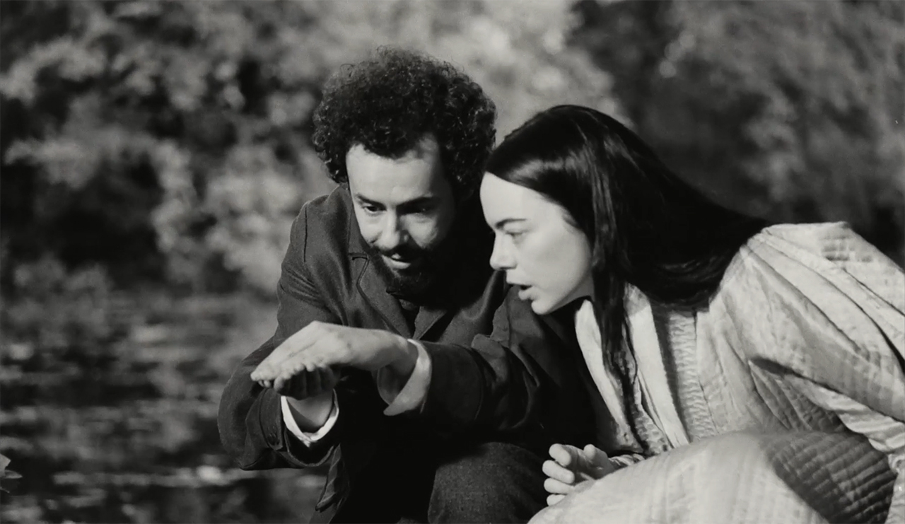
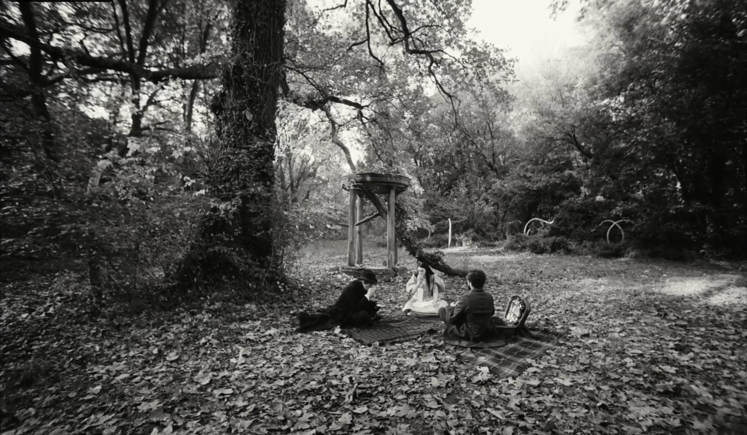
Funny fact: Yorgos Lanthimos wanted to build a forest for the stroll scenes, but they ran out of money and had to compromise, filming instead in real woods outside of Budapest. “Luckily,” Robbie Ryan adds, as he couldn’t imagine the best way to light such a huge space on stage. To add contrast to the black-and-white sequences, they brought an 18K to the forest, which crafted the same “unreal reality” feeling.
Using practical lights and unusual film stocks
From their work together on “The Favourite”, Robbie Ryan also knew Yorgos preferred practical lights and loved to use them as much as possible. On “Poor Things”, however, this approach posed enough of a challenge to overcome.
The color sequences of the film use Kodak Vision3 500T 5219 and a limited run of 35mm color reversal based on Kodak’s Ektachrome. The latter was the same stock that the DP of the “Euphoria” series, Marcell Rév, re-animated for the show. As Robbie explains, Ektachrome is immensely beautiful but also slow, so they had to use it mostly in bright or daylight scenes. In terms of filming the interior, sometimes they couldn’t avoid very dark and even underexposed shots. He learned to go with the flow, trust Lanthimos’s vision, and hide LED lights anywhere he could.
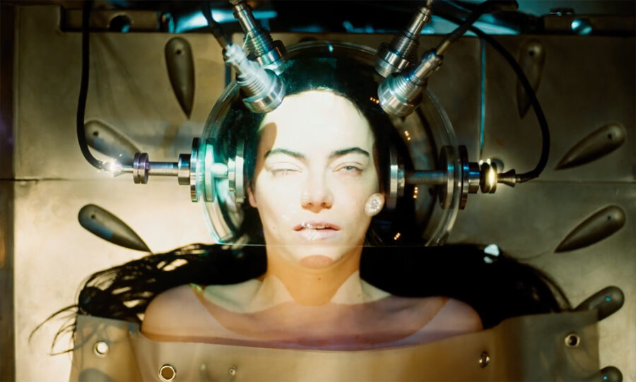
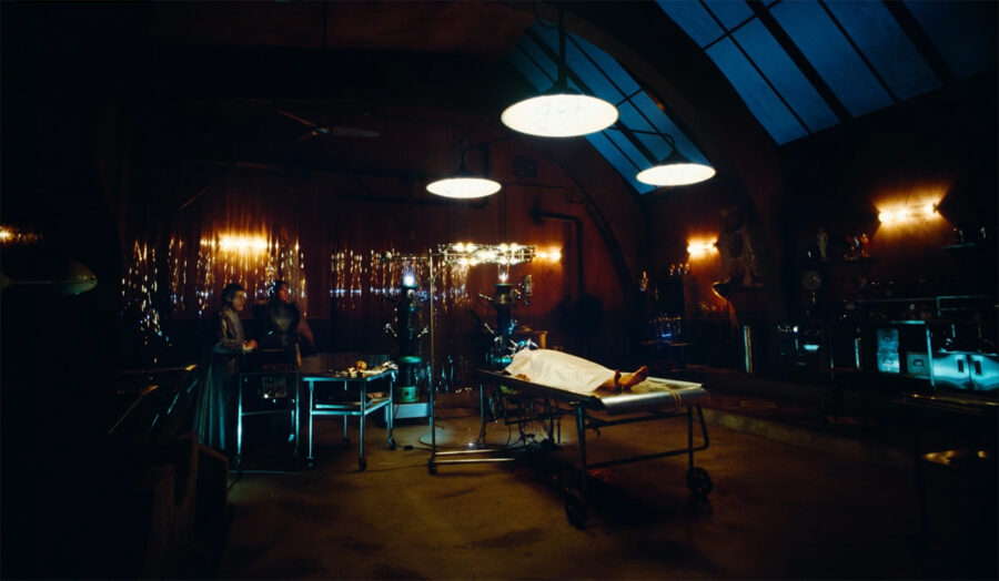
One of the most challenging (and also Robbie’s favorite) scenes was Bella’s reanimation sequence. The first problem was to light the set with practical sources. That said, the filmmakers didn’t care about making it look 100% authentic (the Victorian era, in which the story takes place, featured only gas lamps). The second achievement was using a special camera which Robbie Ryan calls “a Frankenstein of its own”. The so-called “Beaucam” VistaVision is normally used for special effects and miniatures. It moves the film stock horizontally through the gate and produces a bigger negative on the end called Lazy-8. It’s a beautiful format, but the tests proved the camera to be too noisy for dialogue scenes, says Ryan. That’s why although Yorgos planned differently, VistaVision’s time to shine came exclusively during this scene.
Language of lenses: rules and lack thereof
When I wrote about Yorgos Lanthimos’s intuitive approach to filmmaking, I wasn’t kidding. Robbie Ryan confirms: They didn’t use storyboards (except for a couple of complicated scenes with numerous departments involved), nor did they have a shooting order. The Director would come on a prepared set and say they should start with a zoom-in on Emma Stone’s face. To him, it didn’t matter whether they had to film a wide establisher for this specific scene afterward as well. This taught Robbie to develop solutions on the go.
The only rule they established in pre-production was the choice of lenses – five in total – including a zoom (ARRI Master Zoom 16.5-110mm). They would switch between glass according to the situation and the emotional meaning of the scene, and also aimed to keep the perception of the story fresh. Among their lenses were peculiar exemplars such as the rare portrait Petzvals (58mm and 85mm), built for projectors more than 100 years ago. These are known for their distinct bend bokeh with a sharp focus in the center and crazy spiral shallowness on the sides.
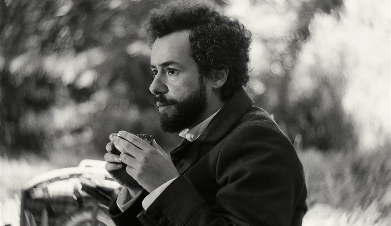
Although the lack of rules and planning had to be a nightmare for the AD, who, I can imagine, had to juggle every shooting day, it was also a very liberating experience. Following your gut, being in the moment, and playing around are, after all, at the core of creativity. The best outcome is: This playfulness transferred directly into the film, supporting Bella’s character whose journey is also very liberating in a way. I felt it. Did you?
The idea behind the superwide fisheye lens
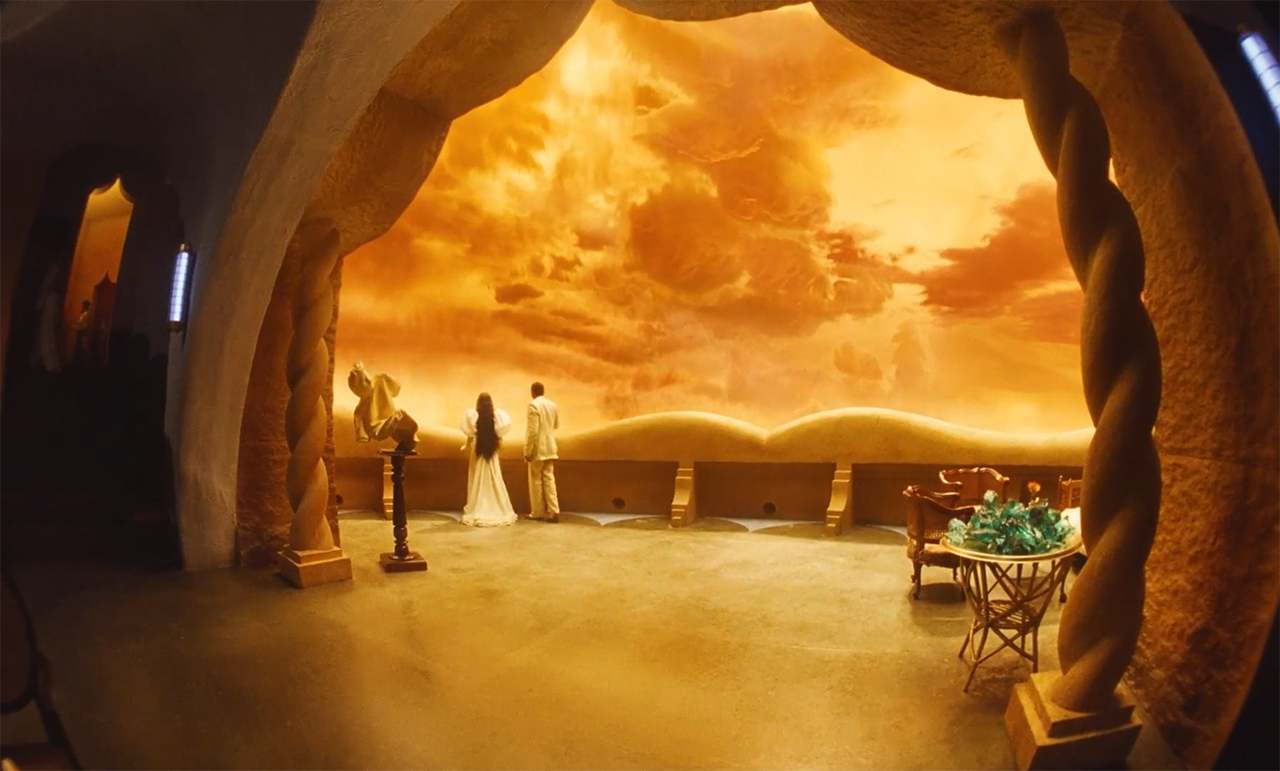
One of the exotic visual tools of “Poor Things” is a rare fisheye look that pops up unexpectedly in some scenes. Lanthimos’s concept was based on early photography references that had a vignette and looked like a porthole into the world. To achieve this effect, Robbie Ryan used a 4mm lens (T2 OpTex Super Cine) that captured a super wide view without too much distortion.
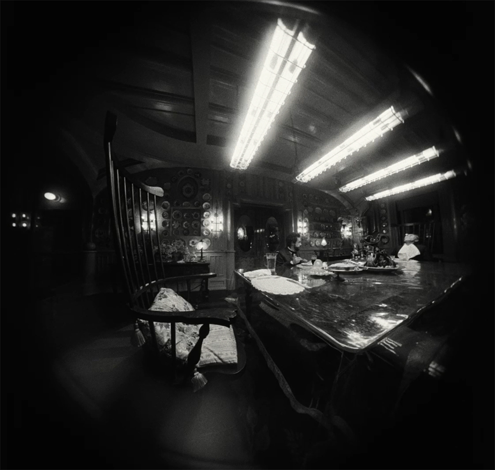
How does this visual composition affect us, the viewers? First, it’s a completely different perspective that gives us a feeling of being closer to the characters – as if we could almost step through this porthole. Secondly, we’re used to “normal” establishing shots that help to place ourselves in the film space. The fisheye frames of “Poor Things” have the opposite goal: they’re intended to disorientate the audience and cause our minds to take a moment to adjust and focus our attention.
Black and white and color: behind the scenes of the decision-making
Let’s talk about the black-and-white sequences for a moment. Within the first half hour, the film plays out in monochrome, and when we left the cinema, we discussed when and why the story transitioned into color. Among our theories was the idea of discovering the world for the first time, and how we dive into its lush and juicy life when Bella starts her travels.
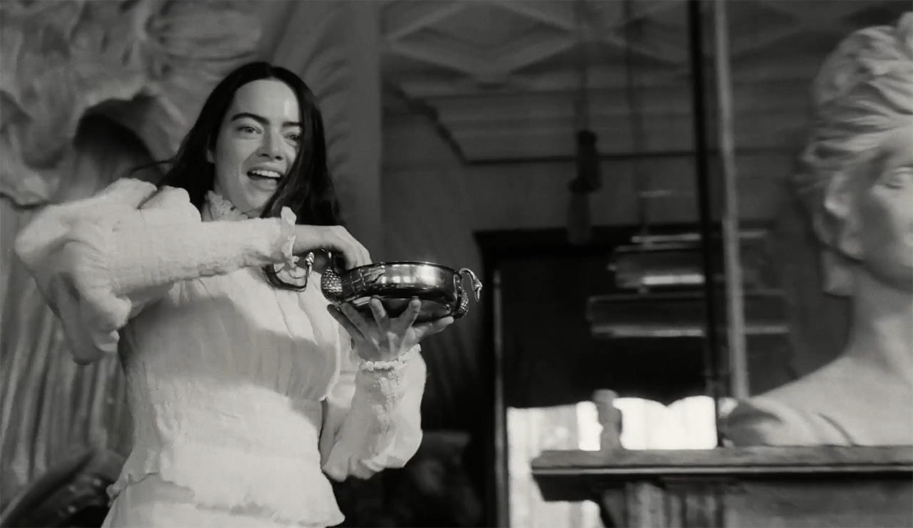
Well, Robbie Ryan would call this “post-rationalizing”. In reality, Yorgos Lanthimos came up with the black-and-white decision 8 or 9 days before they started shooting. He just had an instinct that it might be a good idea. As Robbie recalls, it was a real hustle for production designers. Although they made sure to have lots of texture on the sets anyway, ignoring color was a bitter pill to swallow. In the end, we might agree: It was indeed a powerful and beautiful decision, giving the film another level of depth.
Behind the scenes of Poor Things – shooting on the volume
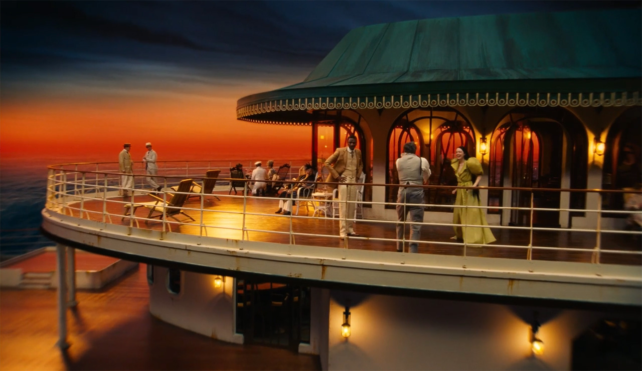
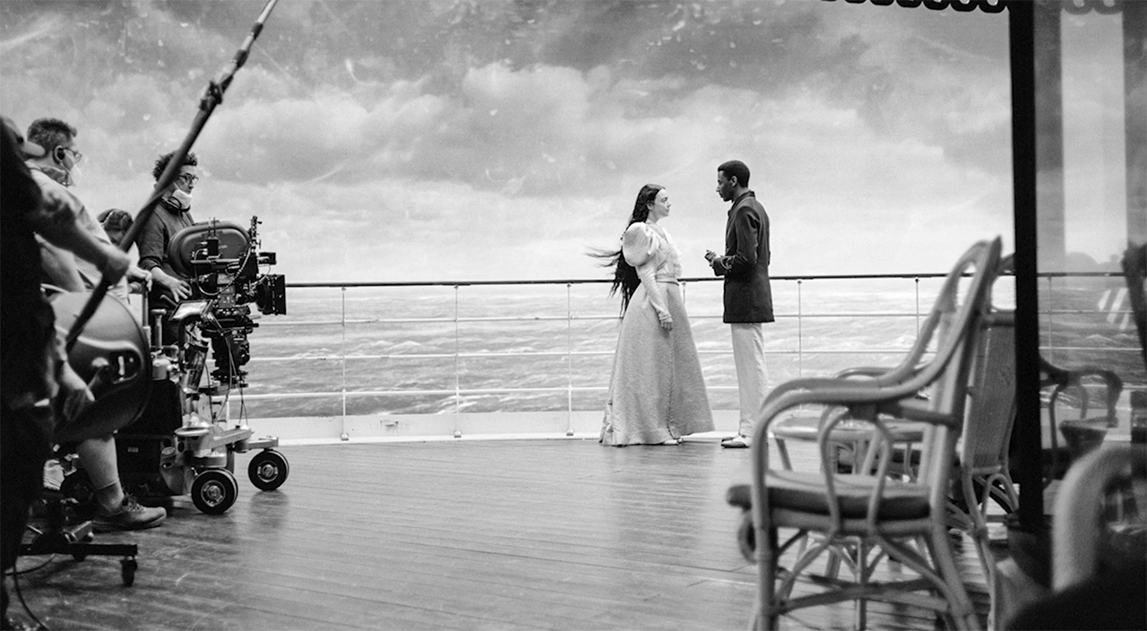
Apart from building the sets, filmmakers also worked with miniatures and painted backdrops. For the latter, they even used Volume. Here, Yorgos Lanthimos, Emma Stone, and Mark Ruffalo break down some of the scenes, including the ship sequence where surrounding LED screens created an absolute immersion for both crew and cast.
Robbie Ryan found these fantastical backdrops to be valuable as they influenced the choice of lighting colors and provided a creative playground for crafting elements that do not exist, such as a vast sunset. At the same time, he had concerns about unwanted light spill on the screens, which were, of course, much closer than the real sky would be. In the end, he fell back on the VFX specialists who did a fantastic job of creating the final look for the fictional exteriors.
Other curious behind-the-scenes of Poor Things
Did you know that “Poor Things” was also Yorgos’s first time working with a composer (the soundtrack is a jewel on its own)? There are many other stories from the set of this weird yet amazing movie: from funny, shared moments to technical insights on cross-processing the film. You can get further glimpses of them by watching the full ASC conversation on MZed.com.
I must admit that I would definitely like to work on a set like this. And you? How did you like the hand-crafted and truly bonkers world of “Poor Things”? What do you think about the slightly chaotic and intuitive filming process of Yorgos? Share your thoughts with us in the comments below!
Full disclosure: MZed is owned by CineD
Join MZed Pro now and start watching today!
Feature image source: The ASC/MZed.


