![]()
Aura Frames has emerged as a dominant force in the digital frame world, and it’s easy to see why. The stunning image quality and ease of use make it a top choice for displaying photos.
Most recently, Aura Frames came out with the Walden frame, its largest offering to date and the only one that can be wall-mounted. It’s a great entry point for a digital frame that looks good and is easy to use, whether for a self-purchase or a gift.

It won’t fully mimic an actual print, but the ability to scroll through tons of images and videos between multiple members makes it feel like a must-have for a home.

Image Quality
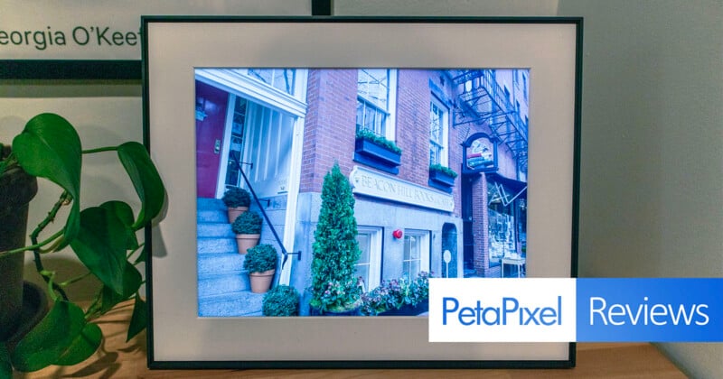
Most importantly, an image on display has to look good, and on that front, Aura excels. The picture quality is solid, and the colors are bright, but the display’s dynamic range can’t match what a high-quality print can accomplish. The blacks are slightly grayed out compared to a print or even a modern iPhone screen. This isn’t as noticeable without a side-by-side comparison, but photographers with an eye for detail might pick up on this.
Further, the matte screen doesn’t mask the fact that it is, after all, a screen. It doesn’t quite mimic the look of an authentic print. From further away, this is less noticeable. With the Walden’s size and the ability to mount the frame, this potential downside is easier to mitigate.
![]()
I was most worried about vignetting around the edges, but after setting up the frame, I didn’t notice this to be an issue. From the side, there is the slightest hint of a shadow coming from the edges, but it’s incredibly subtle. Plus, I didn’t notice this when looking at the frame head-on.
I found myself most frustrated in low-light settings. As the sun sets, the screen’s light becomes far more noticeable, making it look more “artificial.” The illusion of a framed photo and not a screen is broken, and I found myself less enamored with the look. As the light gets dimmer, the screen will turn off entirely unless you schedule shut-off times. There were moments when the light was low, but I could still see, perhaps when watching a show or reading with low lighting, and the black box felt jarring. I would have preferred the frame to dim further than it shutting off entirely. It’s also possible to change the shut-off to a specific time rather than the surrounding light.
That said, the main draw of an Aura frame isn’t the quality, even if the image does look quite good. Rather, it’s the digital functionality. In this regard, I felt the tradeoff in quality was worth it, as the fidelity wasn’t lower than a print to the point of being an issue.
![]()
A Frame that’s Pretty as a Picture
The frame itself looks nice and has a sleek, minimalist design. Unlike Aura’s other options, though, it only comes in black. The frame is much thinner than anything else available on Aura’s site. This isn’t my favorite style, but it’s simple enough to be inoffensive and can fit in with many home aesthetics.

The textured matte looks great, especially against the dark frame. This also subtly hides the light sensors, which blend in exceptionally well. Along the top and side is a touch bar that lets you manually turn off the frame, remove an image from the rotation, or see details about when the photo was taken and who uploaded it. Swiping along the touch bar also lets users scroll through images. These features are also very discreet, which was a priority for me.
The Walden frame can sit on a surface or it can be mounted. I opted for a table display because I didn’t want to deal with hiding the cord. It’s thick and very noticeable, so it has to be hidden behind the wall or with a separate cord cover, which felt like a hassle. It’s covered in fabric, and while that’s great for durability, I found it frayed pretty easily.
![]()
Plug and play
One of the best parts of Aura Frames is its ease of use. It was incredibly simple to pull the frame out of the box and immediately get started selecting which photos to display. It can be frustrating to get excited about a smart device only to get caught up in an overly complicated setup process.
The app is very clean and well laid out, too. There are two main screens, one with activity and another with all the photos in a frame. It’s also possible to switch between frames if a user has multiple. For example, one could be set up in portrait mode and another in landscape. Additionally, users might want to swap what photos appear in separate frames, which helps mix things up and avoid seeing the same images.

At one point, I saw a popup announcing Aura Frames was having a sale, but other than that, the app was very simple and felt free of marketing or sales pushes.
Once photos were selected, I could make tweaks like cropping an image. I kept my frame in landscape mode since most of my photos fit that orientation, but I still had portraits I wanted to display. I also enjoy taking iPhone pics in Live Photo mode because of the ability to change the precise moment that gets picked. It’s a great way to avoid awkward blinks or split-second moments that can ruin an otherwise perfect photo. Aura Frames lets you play these as Live Photos or turn the setting off, which I immensely enjoyed. If users want all Live Photos to display as still, they can also turn off auto-play, which will also affect videos.
![]()
It’s also possible to further alter how videos appear. I liked that I could select what snippet would play as a 30-second clip, and for videos shot in portrait, I was able to decide whether I wanted it cropped to fill the screen or if the sides showed a blurred background.
This extends to photos as well. If images aren’t cropped to fill the screen, Aura Frames lets users choose whether they want a pillar box effect or a blurred background. Personally, I dislike the black bars, so I chose the “Filled” option. It’s not perfect, but it felt far more aesthetically pleasing.
A big draw Aura Frames promotes is having multiple users engage with the frames.
In the activity tab, any accounts associated with the frame can see a history of who has added which photos and when. They can “send love” and respond with emojis or even comment on the uploads. This is a fun way to keep people connected and talk about images.

This is where Aura Frames truly shines. The image quality is solid, but combining that and the social aspect makes the products feel special.
I loved the scanning ability. As a fan of instant cameras, I enjoyed being able to import those prints easily. It’s also an easy way to archive old family photos. Having a digital record of images from photo albums that various loved ones have kept over the years is one of the best uses for Aura Frames.
The Gift that Keeps on Giving
In addition to adding multiple people to have control over a frame, Aura lets users set up their products as gifts. Users can actually set this up after ordering and before the frame arrives. There are options to add not just photos to be displayed but also a message to display for the recipient. It’s also possible to add other members to a gift frame, for example, other family members or maybe members of a wedding party to give to the couple.

However, users don’t have to do this before ordering. When setting up an Aura frame, there’s a “Someone else” option that enables the same features. This can be done by scanning a gift setup code on the box or by plugging the frame in. The QR-like gift setup code is great to get things going without removing the packaging, but simply plugging in the frame works for regifting or for anyone who wants to try out the frame for themselves first.
![]()
Are There Alternatives?
There are plenty of other digital frames out there. Users can also opt for a more versatile smart home device like a Google Nest or Echo Show, but those options really lack the curated look that something like Aura offers.
Should You Buy It?
If you’re looking for a digital frame, you should absolutely consider purchasing one from Aura Frames. The Walden is a great option considering its size and the ability to mount it on a wall. But, in truth, any of Aura Frames’ lineup would make a great option. The app and functionality are really what sell the products.


