Vision Pro is an impressive headset but it’s not perfect right out of the gate. Luckily, Apple has a great track record of improving products for years through software updates, and Vision Pro isn’t likely to be an exception. But what should the company focus on first? Here’s what I’d like to see.
Apple first announced Vision Pro to the world on June 5th, 2023, at its annual WWDC event. That means the one-year anniversary of that announcement will likely coincide with WWDC 2024. It’s there where we expect the company will reveal details of its first major software update to the headset’s VisionOS operating system.
While we patiently wait for that announcement, here are the changes that really shouldn’t have to wait until Vision Pro 2.
Window Management
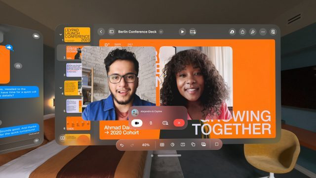
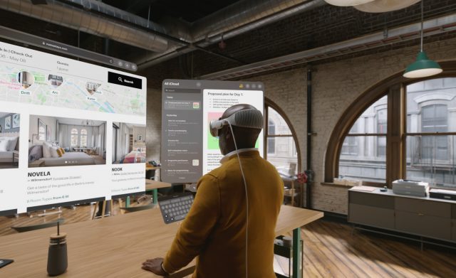
Even if Vision Pro did nothing else, it’s pretty great at making virtual windows appear in the world around you. You can put them anywhere you want, change their size, and use them for apps, games, movies, music, and more. You can place screens all over your house, or wrap yourself in a bubble of screens for the ultimate productivity space.
But while you can individually move and resize windows at will, the windows are largely unaware of each other. They will fade out nicely on the edges so they don’t clip through one another. But it’s very easy to spawn a window in front of another window, making the one in the back inaccessible without moving the first one out of the way.
There’s got to be a better way to manage many windows, and this is the #1 thing I’d like to see in the first big Vision Pro update. And there’s a few different features that should probably be considered.
Pinning
For one, it would be nice to be able to ‘pin’ a window so it never moves, even if you recenter the device (which recalls all windows in front of you). This would allow users to make permanent arrangements of windows around their home and other frequented locations.
Following
You can pick up windows and literally carry them with you from one room to another, but sometimes you just want the window to be a good boy and follow you on its own. A ‘follow’ mode would allow windows to hover near you. You might think they should just attach directly to your face like a HUD, but in practice that’s pretty uncomfortable. Having a ‘soft’ follow system that just slides the window closer once you get a certain distance away would be ideal.
Presets and Groups
I find myself commonly setting up similar window arrangements in Vision Pro. Probably the most commonly used is one big window in front of me with two smaller windows flanking it on the left and right. I’d love to be able to save this arrangement as a preset that I could open with one click, instead of opening and placing three different windows.
And window grouping would synergize nicely with this, not only making it easy to define which windows you want to save into a preset, but allowing you to move all of them as a unit, without breaking their existing arrangement.
App Flow
In Vision Pro, every app essentially becomes its own window. So if you typically jump between an email client, calendar, music player, task list, team chat, and browser window… well you quickly end up with a lot of windows surrounding you. Not only do you run quickly out of space, too many windows means needing to move your head around to look at them more than is ideal for productivity.
‘App Flow’ could let you put multiple apps into a single window, but let you swipe between them with ease. And yes, I’m calling this ‘App Flow’ as a nod to Apple’s Cover Flow system that could be a great conceptual starting point for this kind of feature by making every album cover and app window.
Mission Control
And of course there’s Mission Control, the MacOS view that explodes all windows right in front of you, so you can quickly pick one to focus on. A simple gesture to use something like Mission Control on Vision Pro could put a miniaturized view of all windows in front of you, making it easy to pick the one you want to see rat that moment.
Multiple Users

I get it, Apple. Vision Pro is custom-fit to every customer, so you don’t want people wearing the headset long-term if it isn’t fit for them. And that’s probably a big reason why you can only have a single user profile on the device. Because there’s only one user profile, Vision Pro is inherently not a very sharable device; after all, all of your stuff is right in there… emails, texts, browsing history, etc. It would be like handing someone your phone for the day. Guest Mode is useful for quick demos, but not a replacement for real multi-user support.
But would it be that hard to let someone else who wants to use the same headset do a face scan and order themselves a fitting facepad? I mean, the thing is already easy to swap thanks to the magnets. It would be trivial to pull one out and pop the other in when changing users.
So that’s the fit issue mostly solved, and then there’s the software side. OpticID is already the absolutely ideal solution for multiple users. Because the headset can uniquely and securely identify people by their retina, it could easily differentiate between two registered users without even needing to tell the headset which profile to use. Not only would this point each person to their own apps and content, but the device could quickly load each user’s stored eye-calibration and IPD values for seamless switching.
This feels like a no-brainer, but considering that iPhones and iPads don’t have readily available multiple user profiles, we’re not sure we’ll ever see it.
Charging Indicator on the External Display
The Vision Pro battery has a single LED that I’ve only ever seen turn green or orange. Orange presumably means ‘low battery’ but how low? And what exactly does green mean? Fully charged? Mostly full?
All of these questions could be easily answered by putting a charging indicator on the headset’s front display when it’s plugged in but not being worm. A tiny icon with a battery would be fine, but they could even do something a little more interesting by slowly filling up the whole display from left to right with that cool cloudy aesthetic they use when you’re in fully immersed mode.
We actually know for a fact that Apple has already thought about this kind of usage for the display way back when they first drew up the patent.
Multiple Mac Displays (or better yet, virtualized app windows)

Vision Pro seamlessly connects to a local Mac computer on the same network and presents a sharp virtual display. With it you can use the full power and features of your computer from inside the headset, and you even multitask with Vision Pro apps floating alongside it.
But unfortunately this is limited to a single virtual desktop. Many professionals use more than one display so they can spread out their work with less window management. So it’s clear why someone would want to use more than one virtual desktop.
Better yet, a button to create not virtual desktops… but virtual applications… could be great. Instead of a single box showing your Mac desktop, what if each application could spawn its own window inside your headset, just like other VisionOS apps? This would definitely introduce a lot more technical complexity than just having two virtual desktops, but it would surely be the most seamless way to implement this feature.
Desk Mode
Hand occlusion on Vision Pro makes your real hands show up in front of windows and inside fully immersive content, making the virtual content in front of you seem far more real. Without it, your hands would always appear ‘behind’ windows, no matter how far the window is from you, which breaks the illusion.
But it’s only your hands and arms that can show through. If you’re holding a cup of coffee or using a keyboard and then flip to a fully immersive environment, you’ll see your arms and hands… but the coffee cup becomes invisible. It’s actually a pretty weird experience; almost like the headset is erasing a part of reality that’s right in front of you.
‘Desk Mode’ could continue to reveal anything that’s on a plane in front of you (your desk or table). So your keyboard, coffee mug, notebook, phone, and more could continue to be visible even if you want to be fully immersed.
Gestures
As the first version of this headset, it’s not surprising to find some parts of the experience that just need to be a little easier to do. Opening notifications or the Control Center, for instance, requires looking above you and then clicking on a tiny dot to expand it. Then from there you need to click another icon to reach the actual Control Center.
For how often Control Center gets used, it would really benefit from a system-wide hand gesture to bring it into focus. Gestures are pre-determined hand motions the headset can recognize. Quest, for instance, has a gesture where turning your palm upward and then pinching your fingers will open a quick-menu, which is very handy.
Something similar on Vision Pro would not only make it much faster to check the time and get to Control Center, but it would also make getting to your notifications way faster.
There’s a few other ripe opportunities to speed up Vision Pro with gestures. Opening the app menu, for instance, probably shouldn’t require reaching all the way up to the headset to press a button you can’t see. And gestures should surely play a role in window management.
There’s no telling if or when any of these features might reach the headset, but in the mean time Vision Pro has a ton of useful tricks and settings that you’ll definitely want to know about.


